Petto is a new place in IJsselmonde, Rotterdam, where parents and children aged 0 to 4 play, discover and grow together. It is an initiative of Epos Onderwijs Rotterdam, part of Stichting De Verre Bergen. Petto is the little sister of Oiko, which serves the same audience in another Rotterdam neighbourhood. For Petto we built the complete brand: from brand idea and visual identity to website, print and signage for the building.
Like Oiko, Petto is aimed at young parents, but in a new neighbourhood. The brand had to be a recognisable part of that family while standing on its own two feet. Petto also had to quickly win the trust of parents who didn't know the place yet. And everything had to add up, from the flyer through the letterbox to the front door of the building.
An analysis of the playing field showed how the category communicates. Schools and childcare centres in the area use bright, saturated colours, lots of green and blue, and literal clichés: a rainbow for diversity, a squiggle for a child. Websites feel generic and dated. That was the opportunity: a brand that stands out through its own character and takes parents and children seriously, without losing its playfulness.
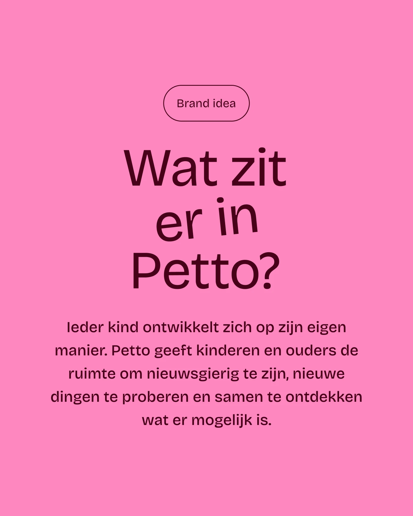
We started from Oiko's brand foundation: the Optimist with a wink. A brand that welcomes everyone, builds trust and makes parenting a little lighter with humour. For Petto, we translated that into a brand idea of its own, already hidden in the name. In Dutch, having something 'in petto' means having something in store: “Wat zit er in Petto?” – what's in store?
Every child develops in their own way. Petto gives children and parents the space to be curious, try new things and discover together what their child has in store. The brand idea makes the name part of the brand and sparks curiosity straight away, in children and parents alike.
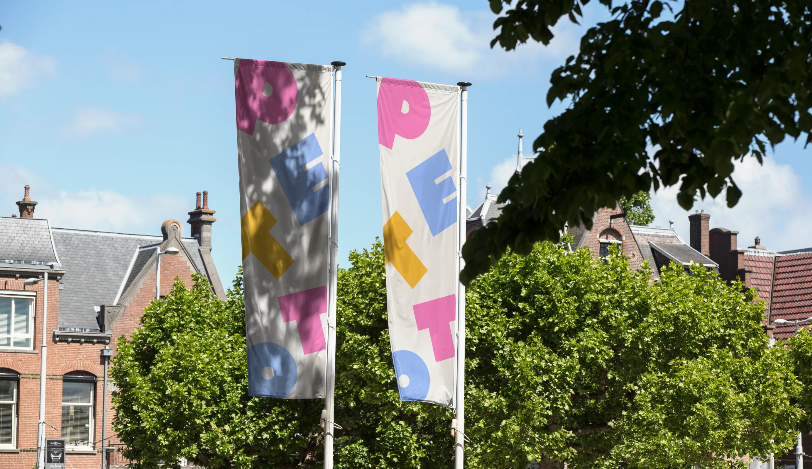
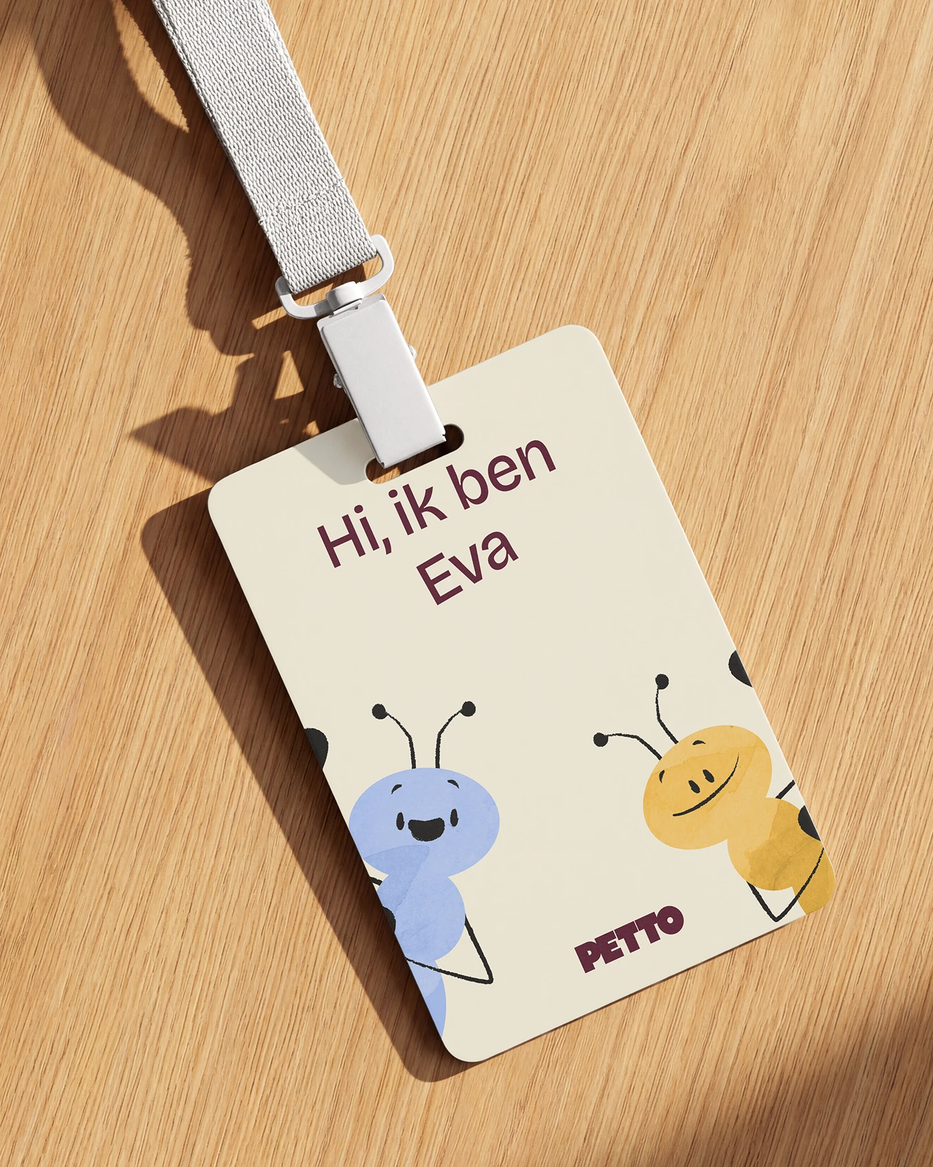
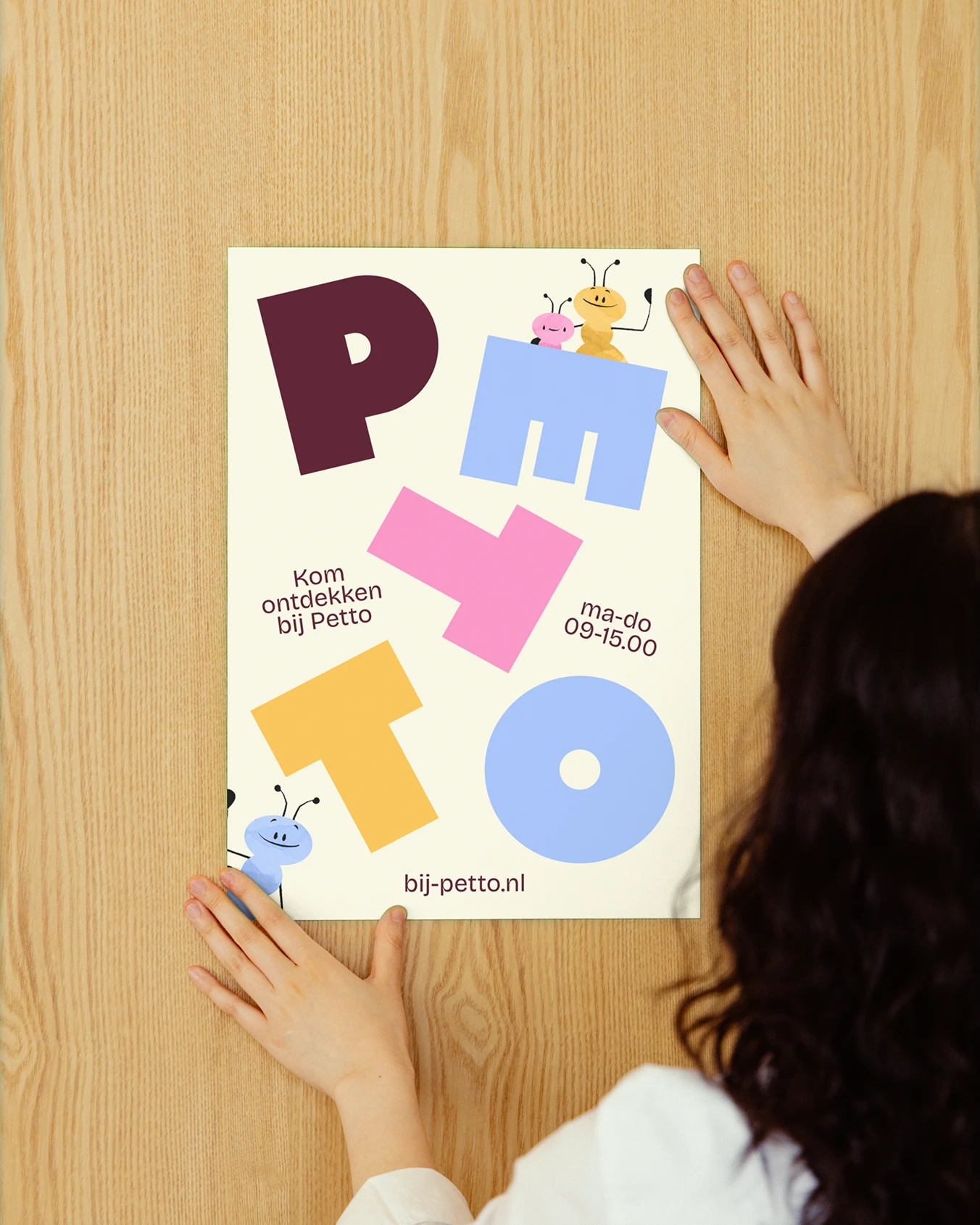
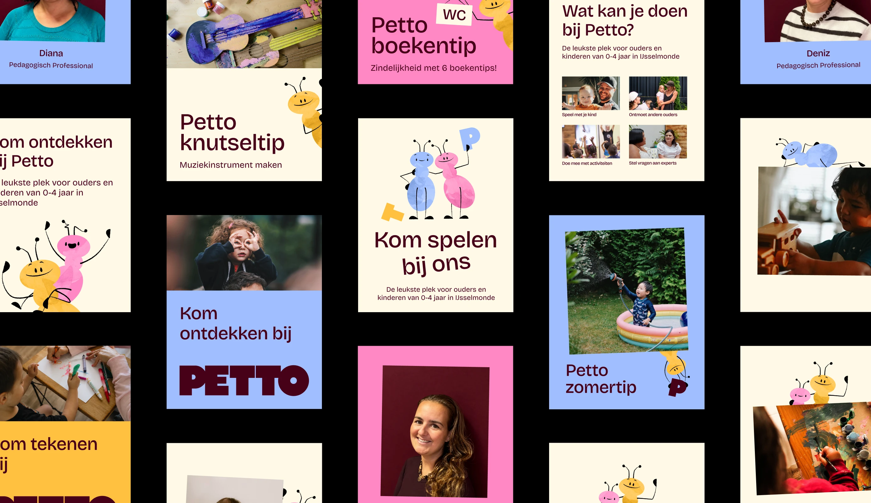
The identity is built from sturdy letters and shapes, a warm palette of cream, aubergine and cheerful accent colours, and photography that captures children's sense of wonder. The wordmark is solid and tactile, almost like building blocks: across the materials, the letters fall, tilt and stack. A family of ants gives the brand character and adds a visual layer that speaks to children. The result feels playful without becoming childish.
Petto got off to a flying start with a brand that stands out through character, without having to shout. The brand idea guides every touchpoint and makes Petto instantly recognisable for children and familiar to parents.
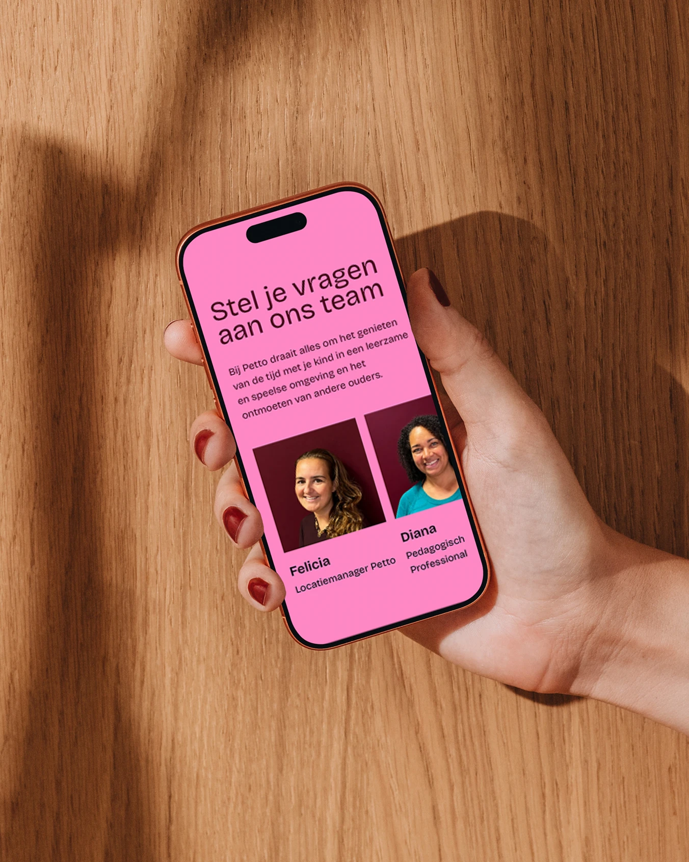
For many parents, the website is their first introduction to Petto, and that is where the brand shows itself at its best. The site is full of small details, animations and interactions that surprise and delight, just like a first visit to Petto itself. At the same time, the one-page site is compact and clear. Parents find everything they need for a first visit in one go: what Petto is, what you can do there and when they can drop by.

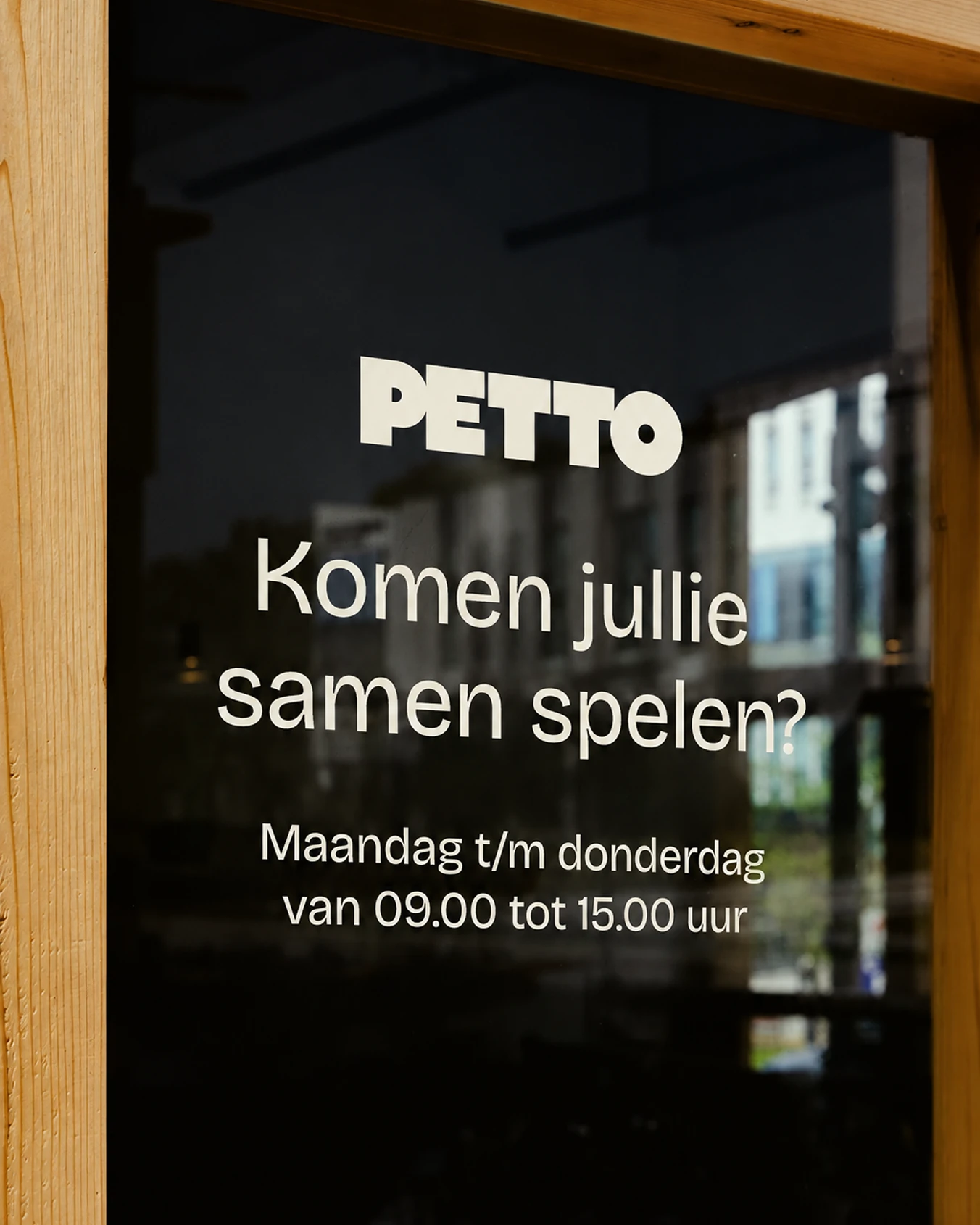
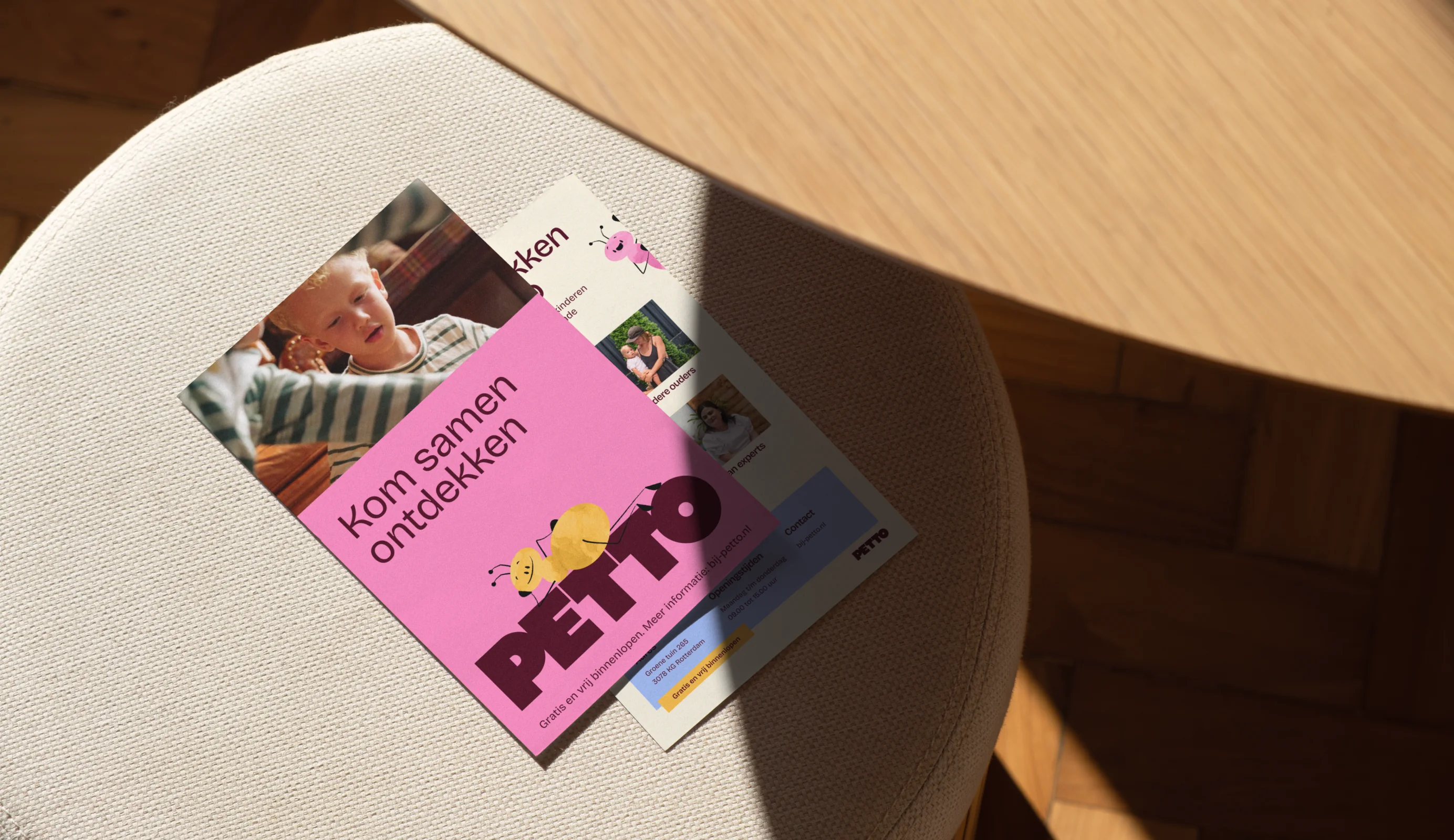
Petto needs to be seen in the neighbourhood. So we translated the brand into posters, flyers and bus shelter ads with a direct invitation: come build, come play, come discover. For day-to-day communication, we developed templates the team uses to create materials that are always on-brand. On site, window graphics turn the building itself into a signboard: passers-by see right away that something is in store here.
Thanks to Sanne and Felicia of Epos Onderwijs Rotterdam for their trust and the great collaboration!