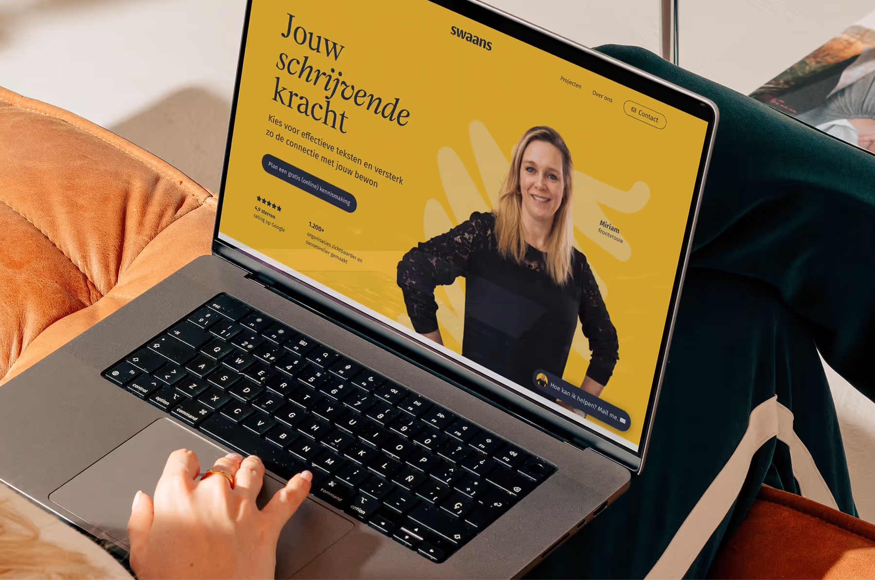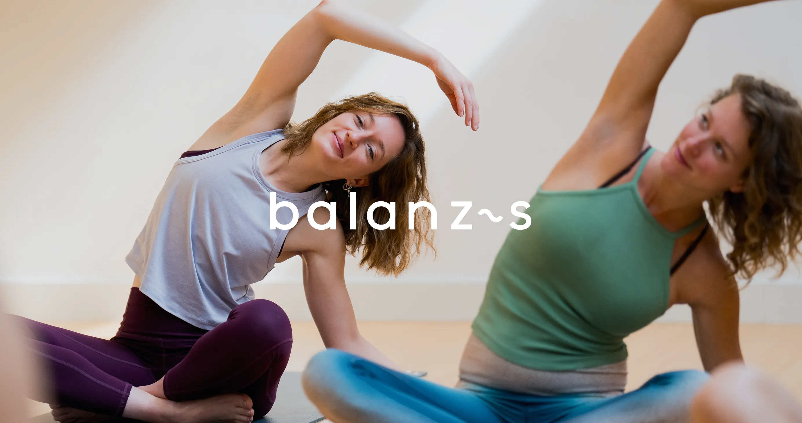
Balanzs wants to keep yoga simple. No egos, no dogmas. Just a warm place where you feel welcome, whether it's your first time or have been in downward dog for years. With 11 yoga and reformer studios in four cities, Balanzs is the largest yoga school in the Netherlands. But their website didn't feel like that yet. The old site lacked the friendliness, accessibility and smile that Balanzs has embodied in real life.
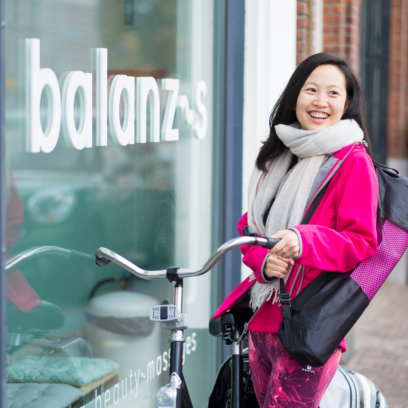
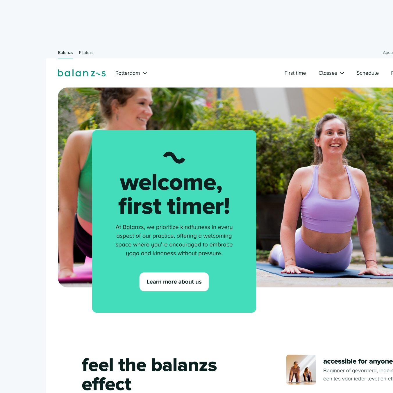
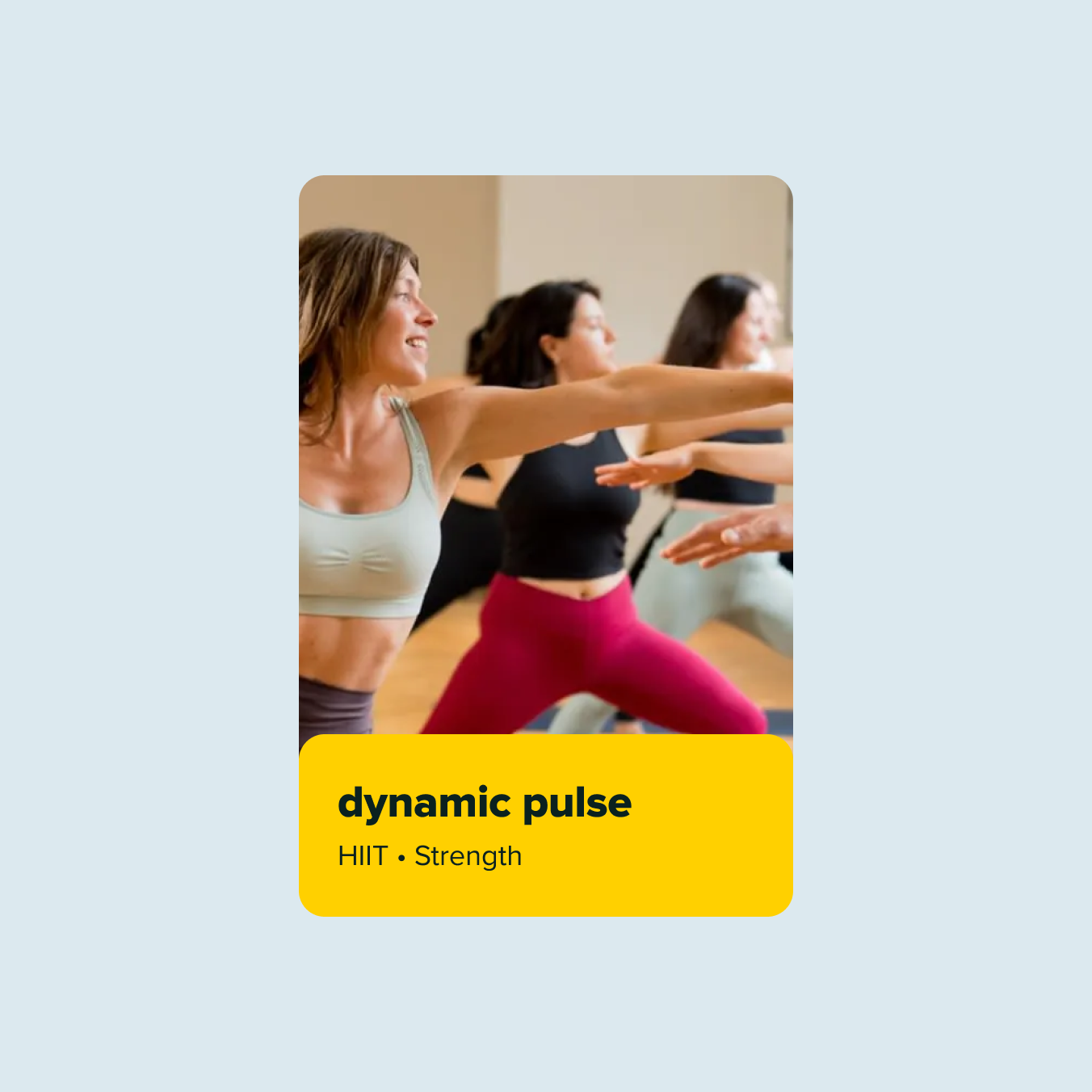
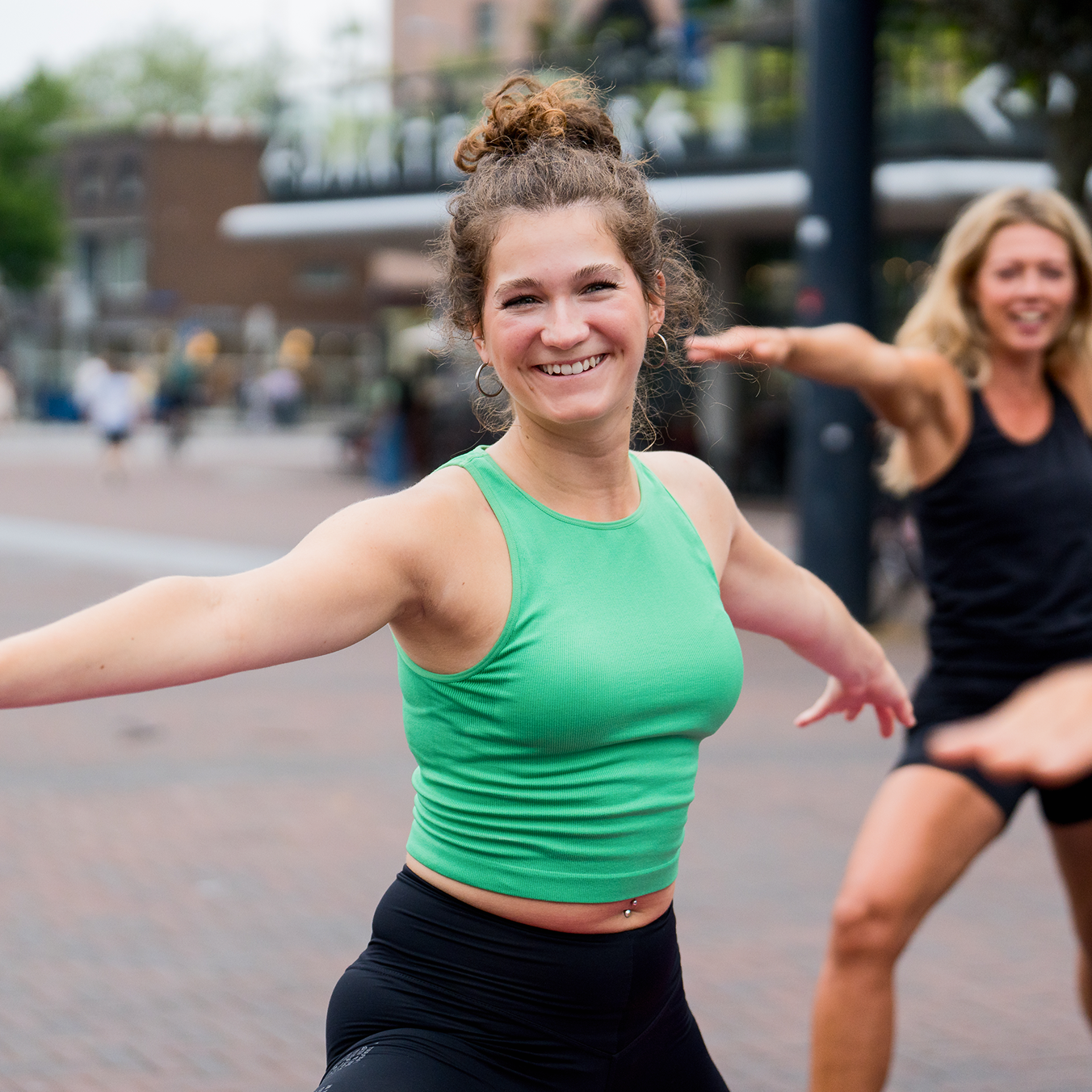
Many yoga websites are made for people who already know what they're looking for. You must understand which lesson suits you, what the differences are and where to start. Balanzs does the opposite. The brand is open, colourful and inviting. Not focused on one group, but suitable for everyone.
We have translated that principle into the website. Designed not only for the returning yogi, but also for someone who is still unsure. Or someone who has never taken a yoga class before.
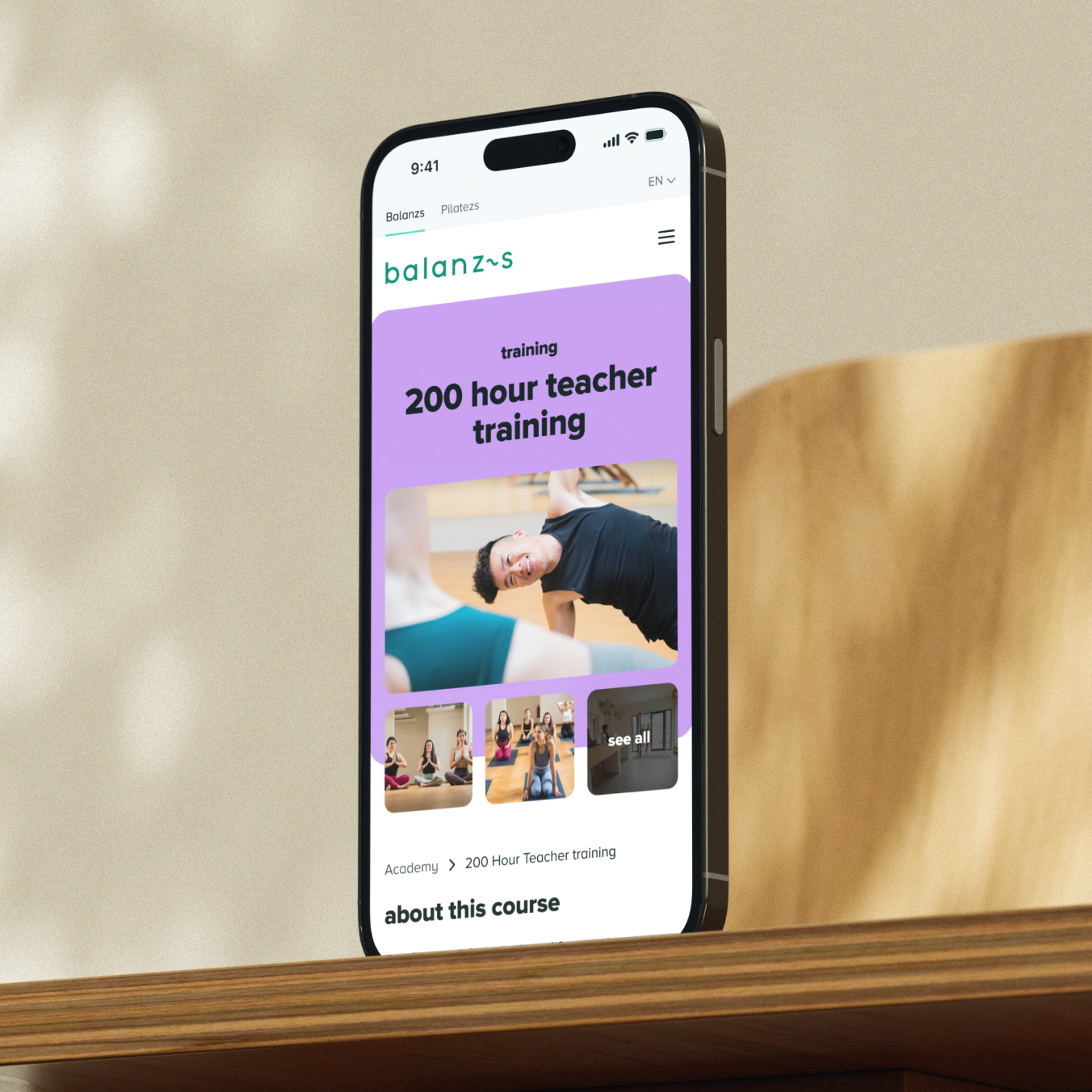
That is why we have focused on small, guided steps towards registration. So you know what to expect. Within the course offerings, we provide context, for example with short training videos per lesson, so that you better understand what you choose.
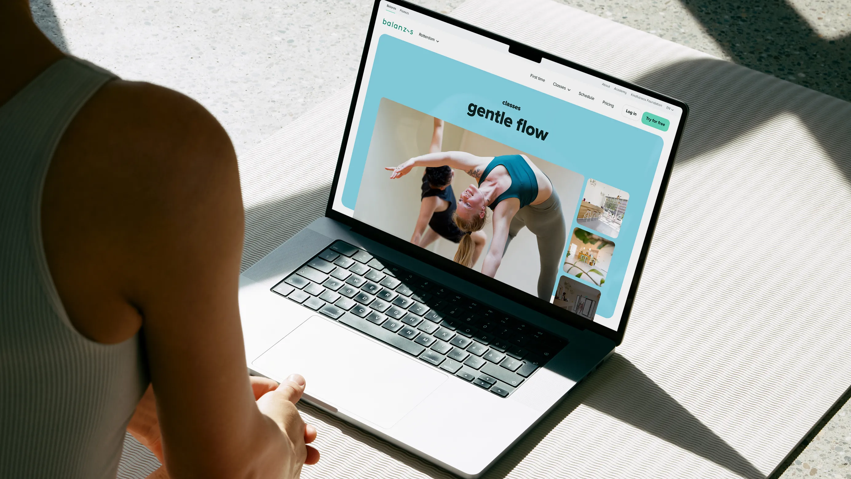
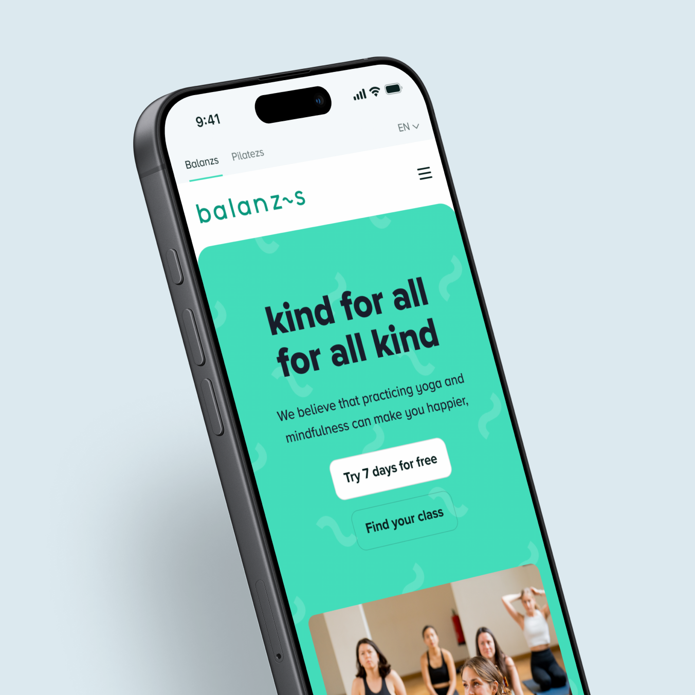
From simple registration to quickly finding your favourite studio, the website will guide you to the next step at any time. On each page, there is something to discover about yoga, Balanzs and their philosophy, without it becoming heavy or overwhelming. No walls of text, but short, focused content that helps you understand and choose. In subtle moments, micro-animations bring Balanzs's brand idea to life: kind for all, for all kind.
Balanzs does not stand alone. Together with Pilatezs and the Kindfulness Foundation, it forms a family of brands with a shared identity, but each with its own look. Instead of three separate websites, we have developed one modular system. A shared component library that contains brand, structure and interaction. From that basis, each brand gets their own character through color and imagery. The experience remains consistent, while the identity for each brand is clearly recognisable.
A special thanks to Sylvie Verstraeten and Zsoka Bernard for the inspiring and, above all, fun collaboration. Thanks also to Tabs & Spaces for the technical realization of the website.