We4U is an app that makes it easier to share tasks and organize help: at home, in the neighborhood, in healthcare, or within a sports club. The idea touches on a fundamental problem in society: people want to help each other, but asking for help is a high threshold for many. And if the will is there, implementation often gets stuck. In chaotic chat groups, loose messages and uncertainty about who does what. We4U offers a new standard.
The obvious thing was to position We4U as a healthcare solution — something for people in a tough situation. But that only tells part of the story. The app works just as well for a football club that schedules volunteers, a community center that distributes tasks, or the employer who wants to relieve carers. The brand shouldn't feel like an emergency solution, but like something you can use proudly. The assignment: design a brand that celebrates collaboration and normalizes asking for help.
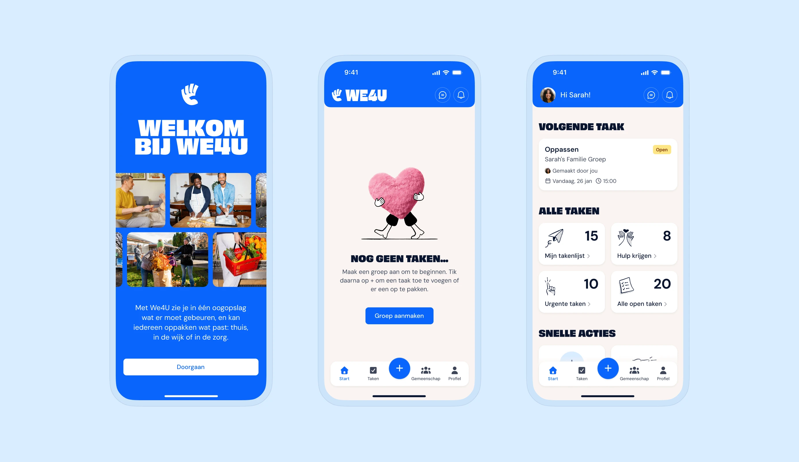
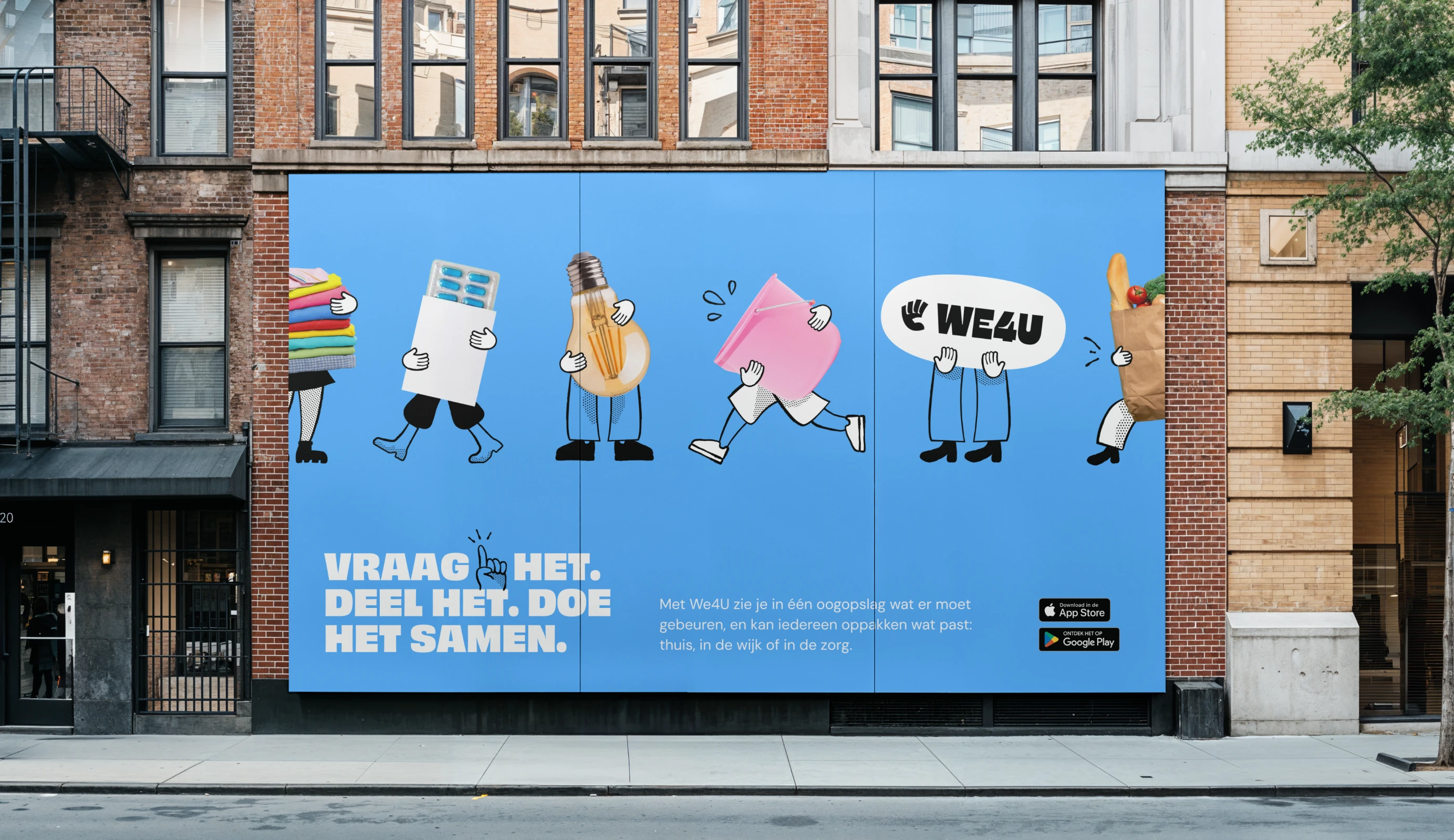
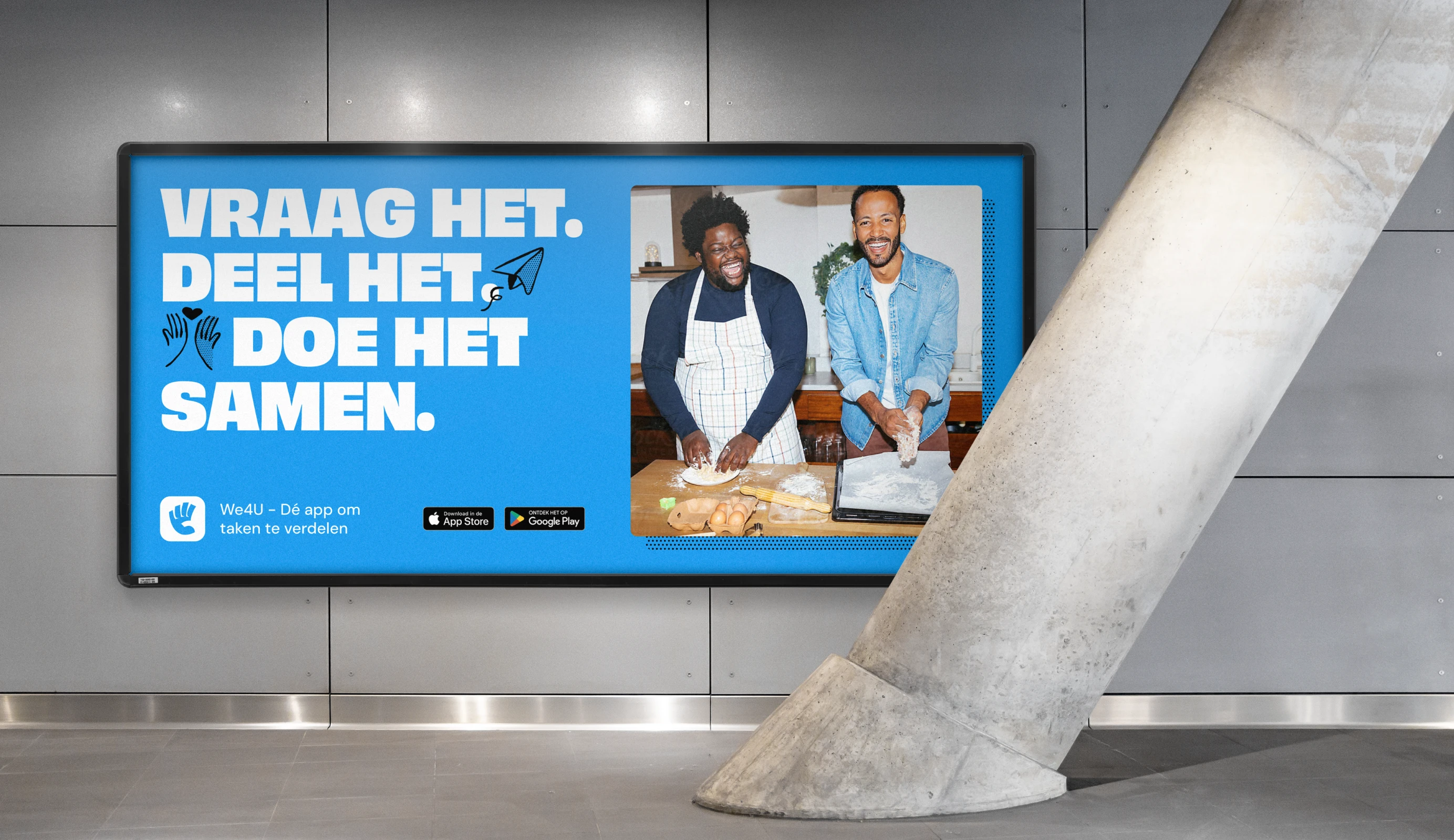
We completely overhauled the brand. Only the name remained the same. We started with brand strategy: positioning, determining archetypes and writing the brand idea. We translated that foundation into a completely new visual identity, including logo, typography and use of color. Cheerful illustrations energize the app and make you want to get to work. Together, everything is possible! The photography shows the joy of doing things together. Finally, we designed the website and implemented the brand in the app's UI, so that the brand experience can be felt at every touchpoint.
A completely new brand that is ready to grow widely. Sturdy enough for a B2B context, fresh enough for a neighborhood group or a sports club and serious enough for the healthcare context. An identity that fulfills We4U's ambition: a society where it is only natural to help each other and to distribute tasks.
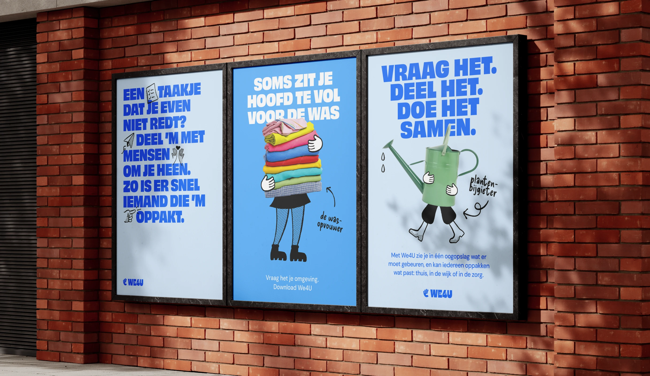
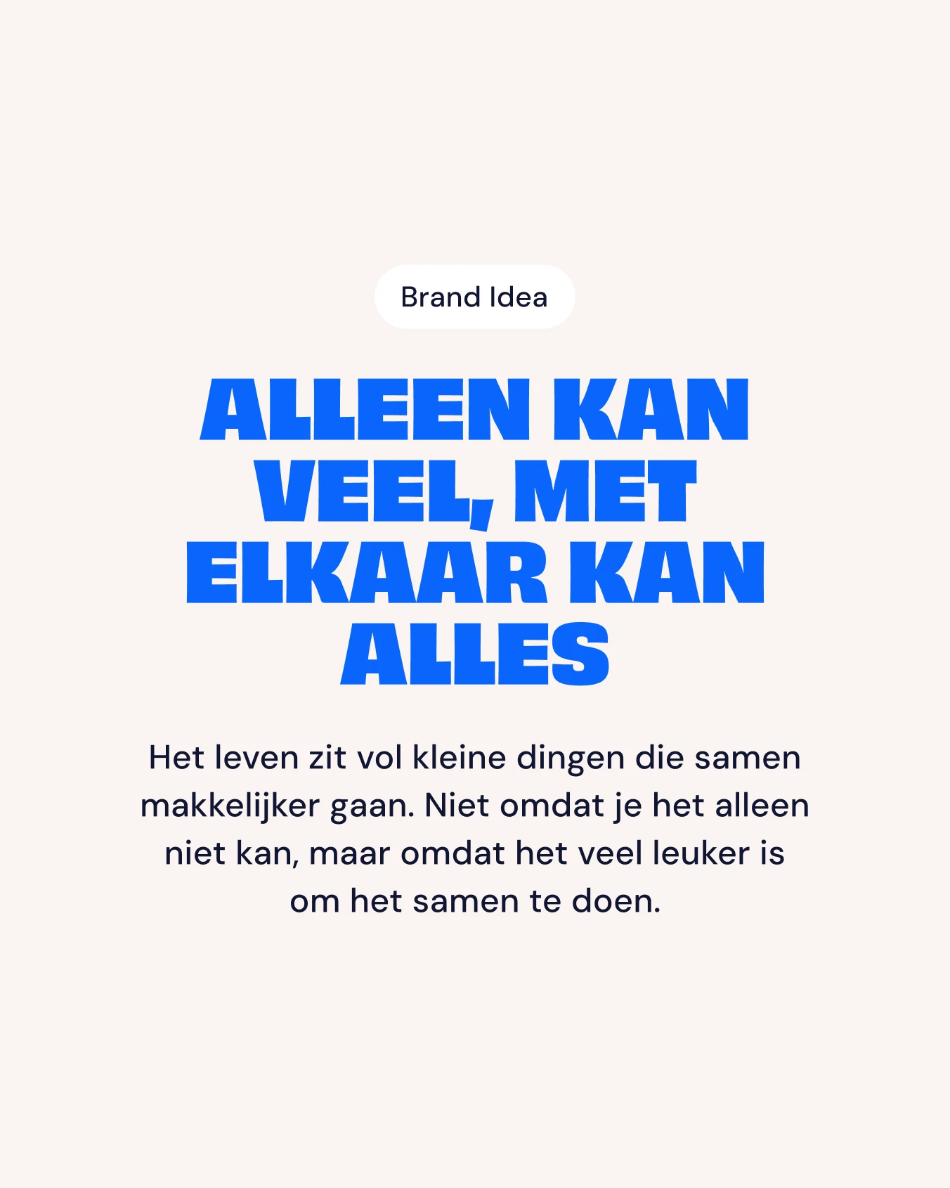
The brand is built on two archetypes: the Optimist, which makes big tasks small by tackling them together, and the Everyman, which is about equality, recognisable and friendly. This combination resulted in the brand idea: 'You can do a lot alone. Together, you can do anything'. This serves as the foundation of the brand. The design, the tone of voice, the atmosphere of photography and the illustrations: everything is an expression of the same idea.

Evers + de Gier have helped us incredibly well. They immediately understood what we wanted and what the challenges were, and made something really beautiful that suits us exactly.
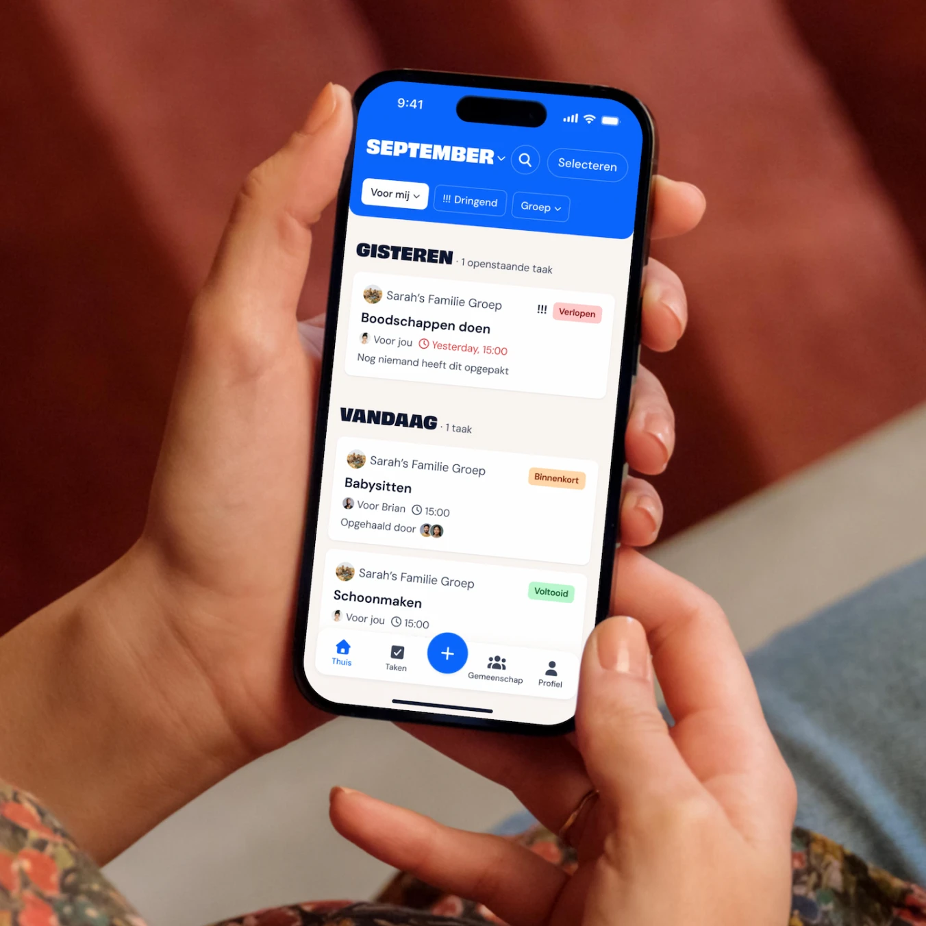
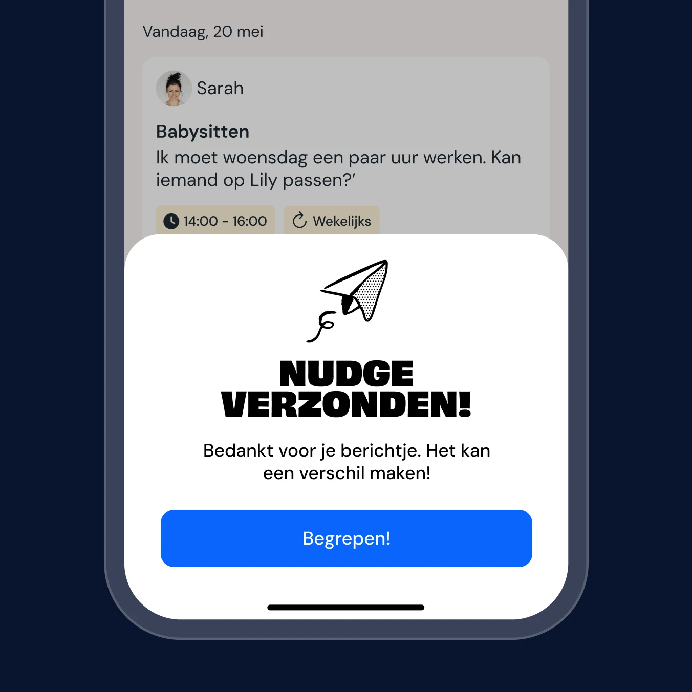
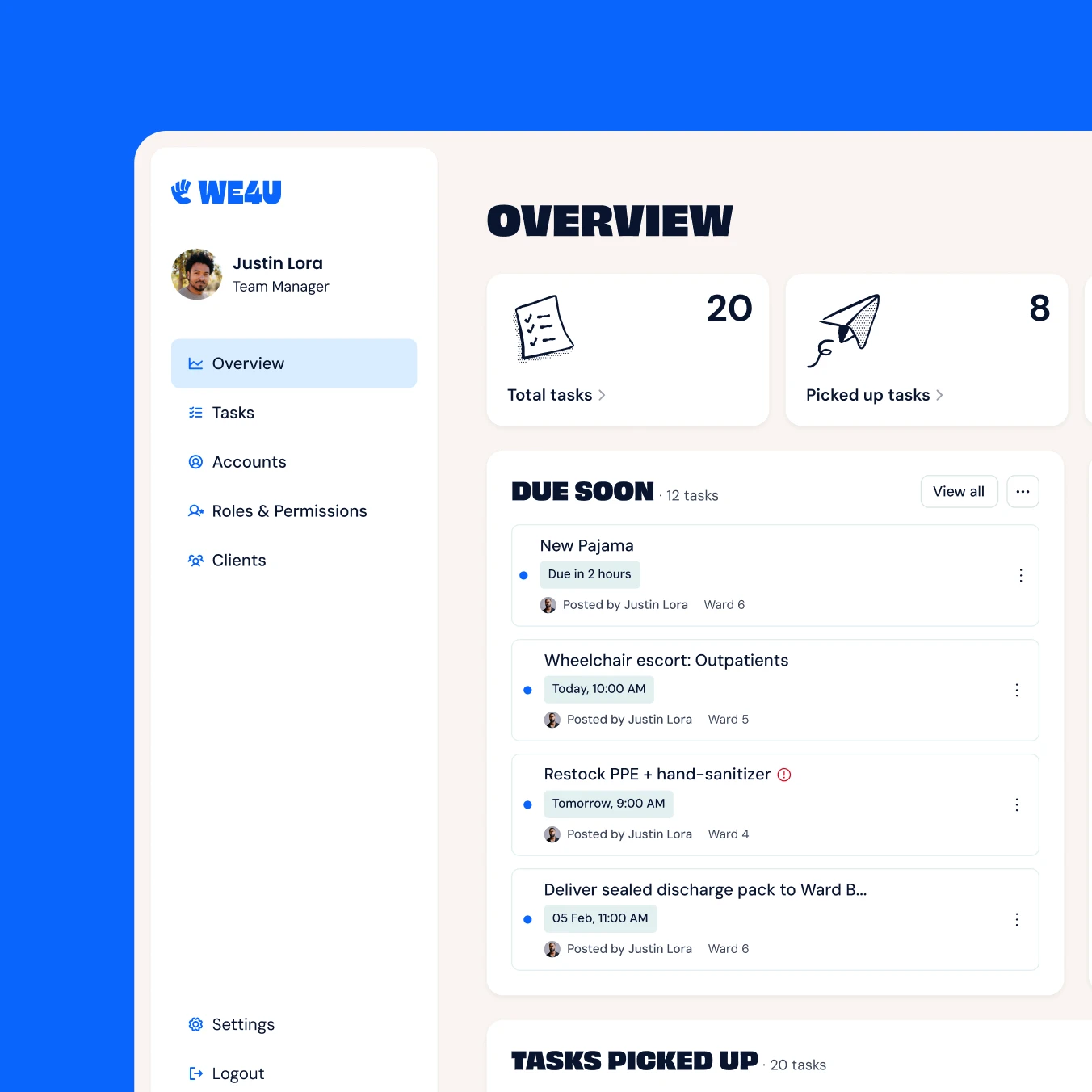
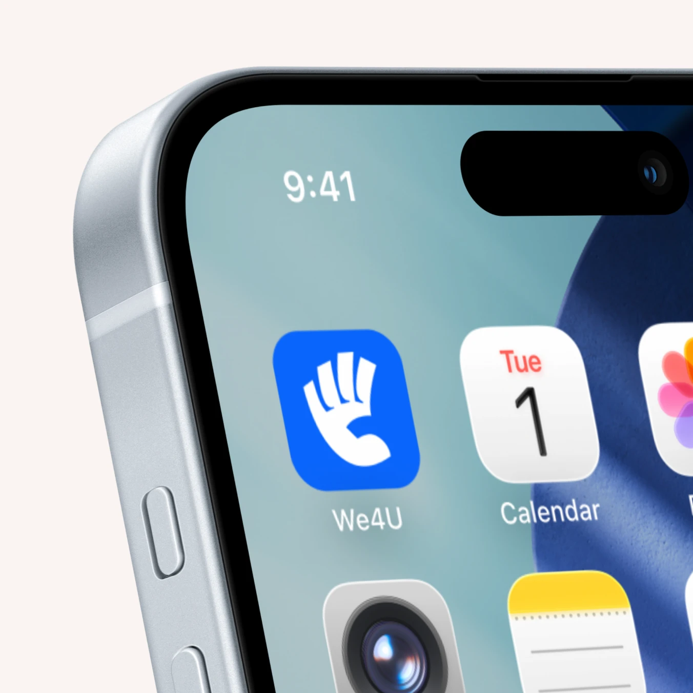
Finally, we translated the brand into the app itself. Not by reinventing the entire interface, but by specifically intervening where we can have the biggest impact: color, typography and illustration. Together, these three elements ensure that you feel the brand feeling as soon as you open the app: optimistic, inviting and recognisable as We4U.