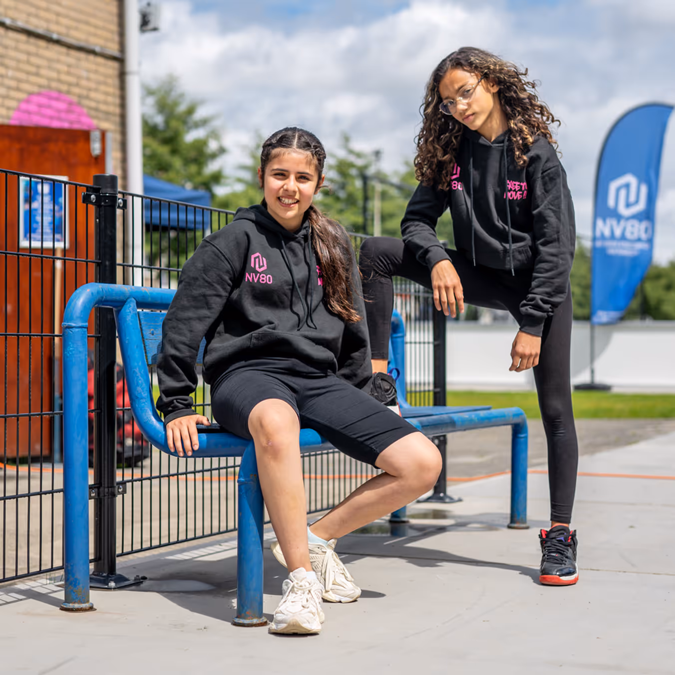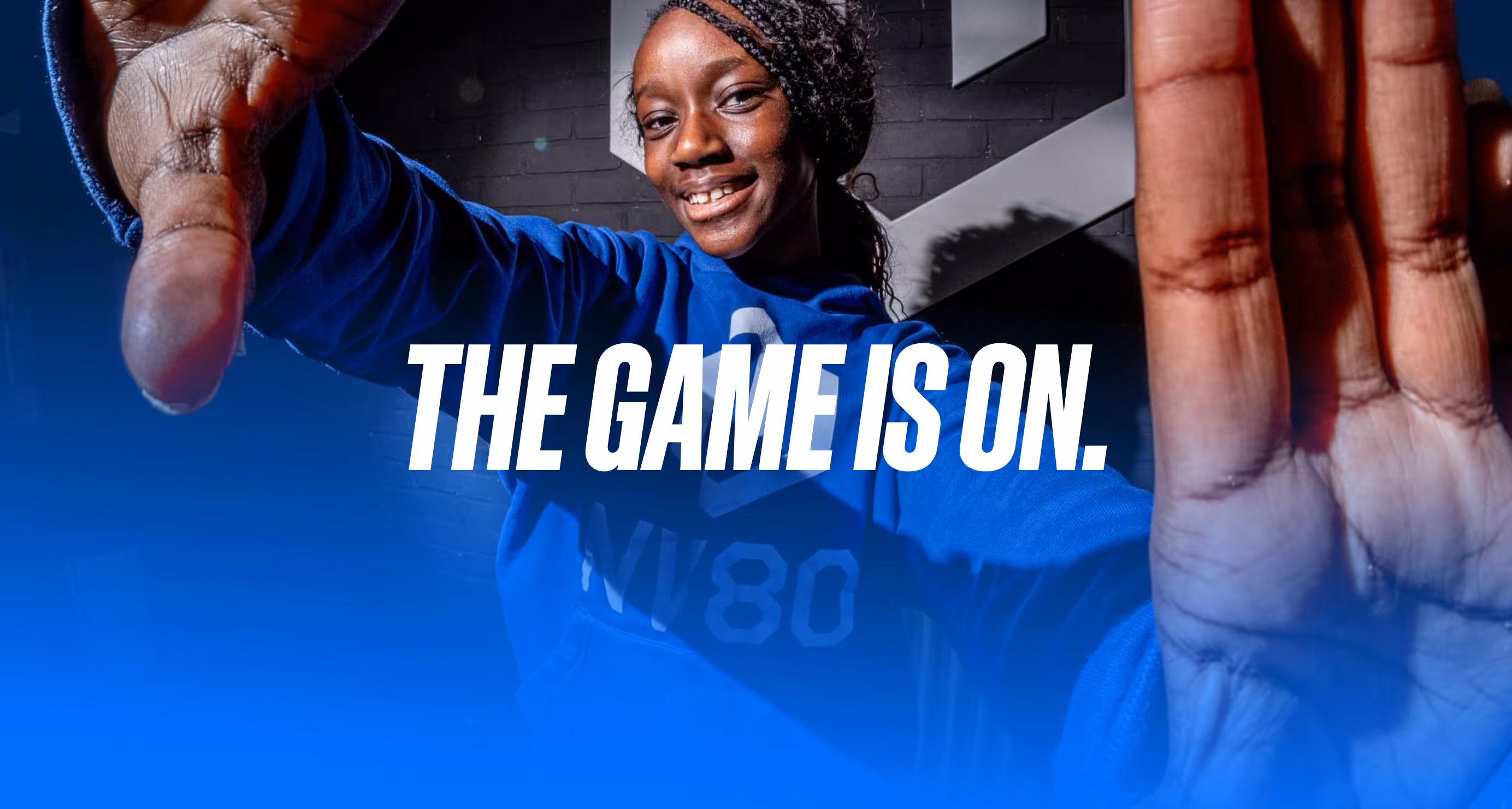
With the growth of NV80, there was a need for a stronger visual identity and a website that really appeals to young people. The challenge was to build a brand that feels like a club you want to be part of. An identity that combines the familiarity of a sports club with the raw energy of urban sports. Not polished or distant, but full of movement and character.
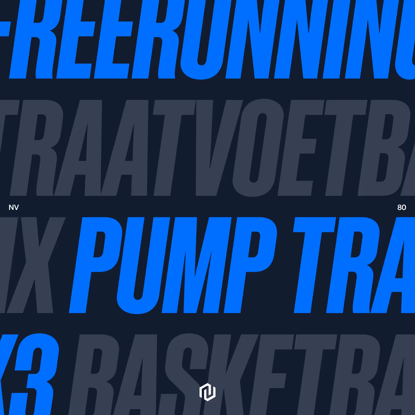
We have combined the familiarity of a sports club with the rawness of urban sports. A distinct palette, great typography, and a fast-paced image. No tricks, but a visual language that you can almost hear running, jumping and landing.
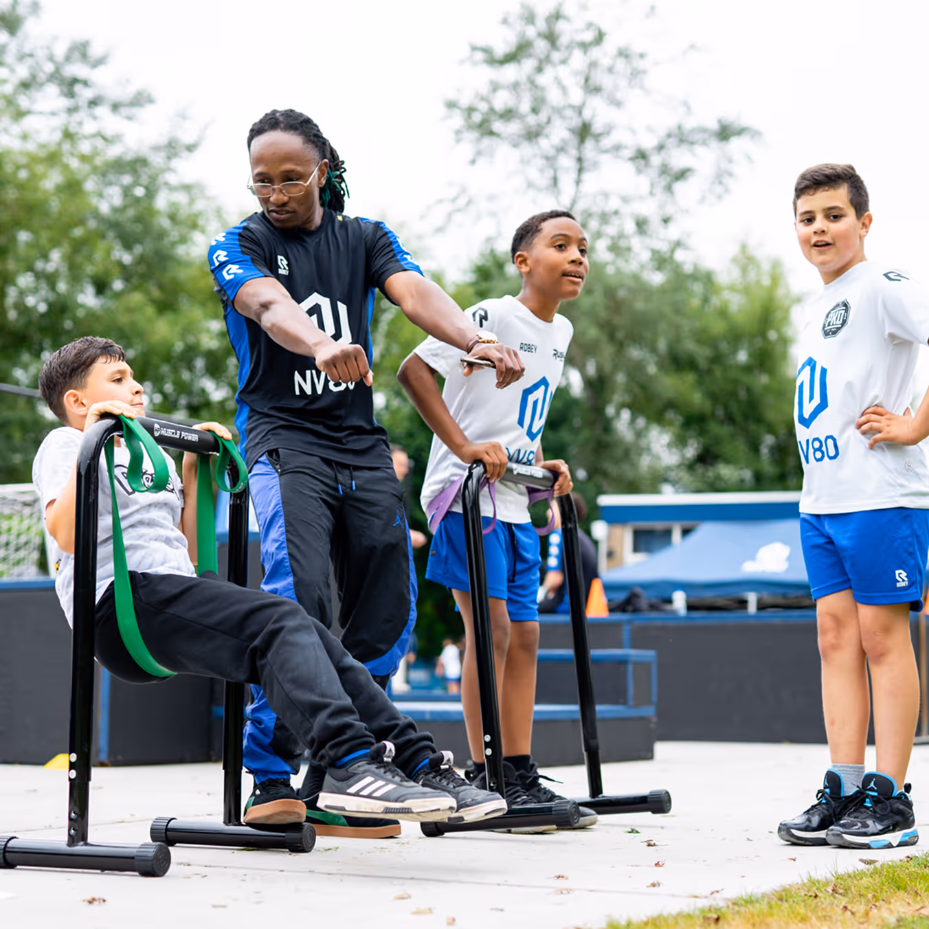
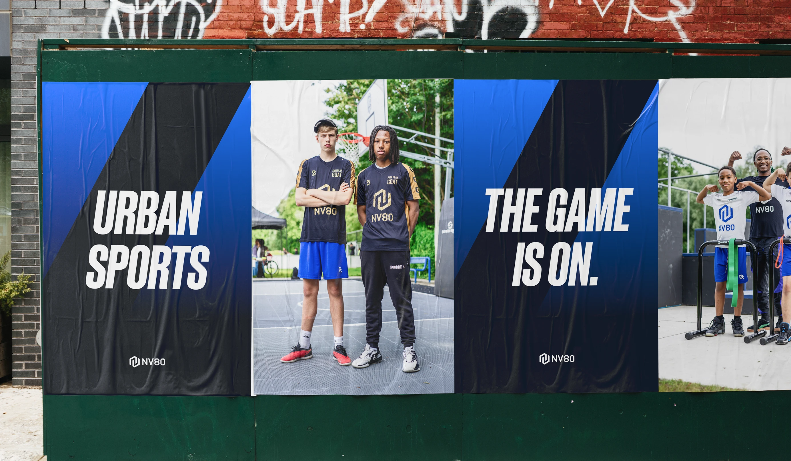
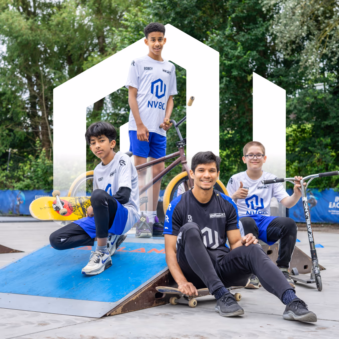
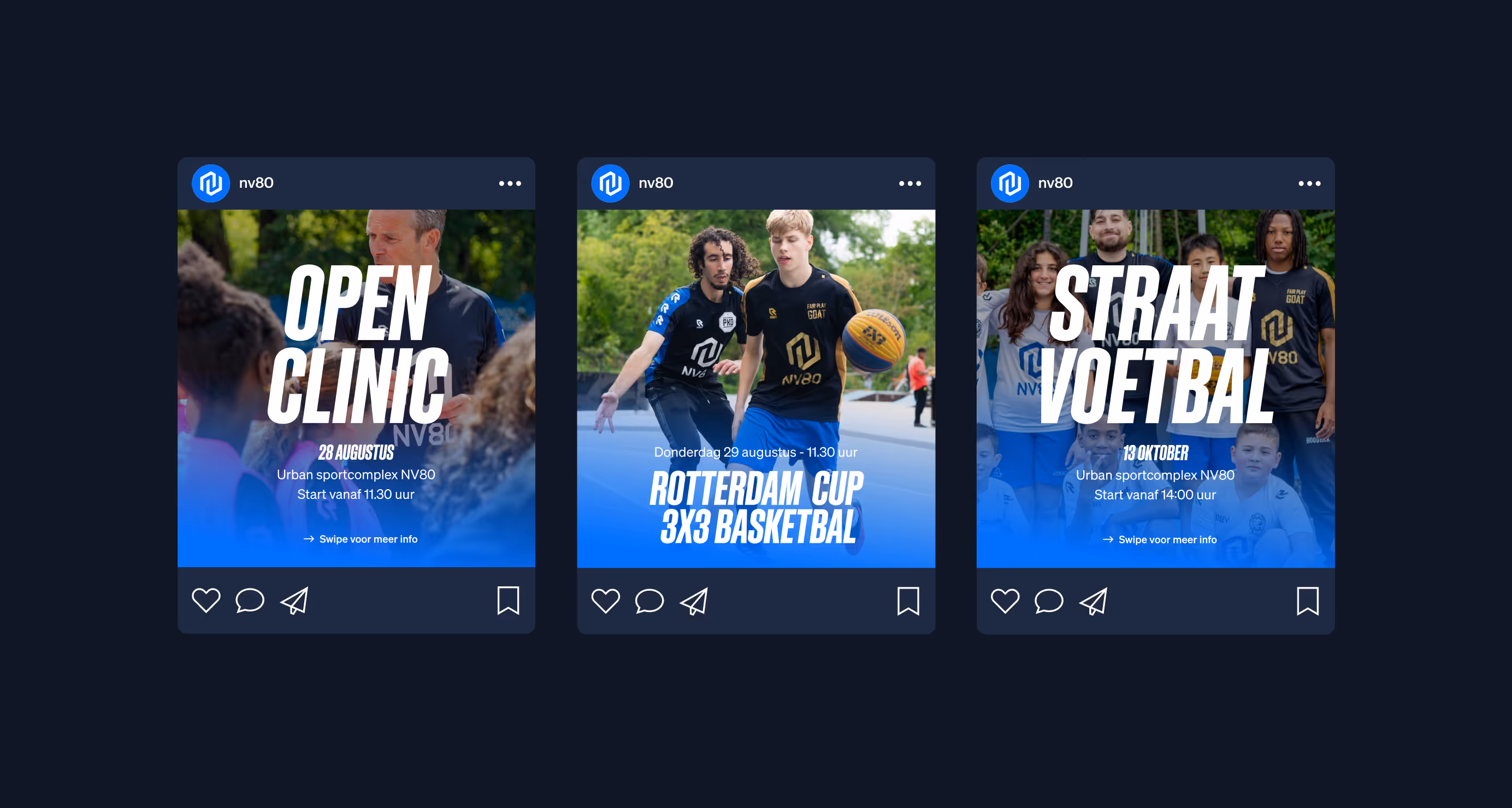
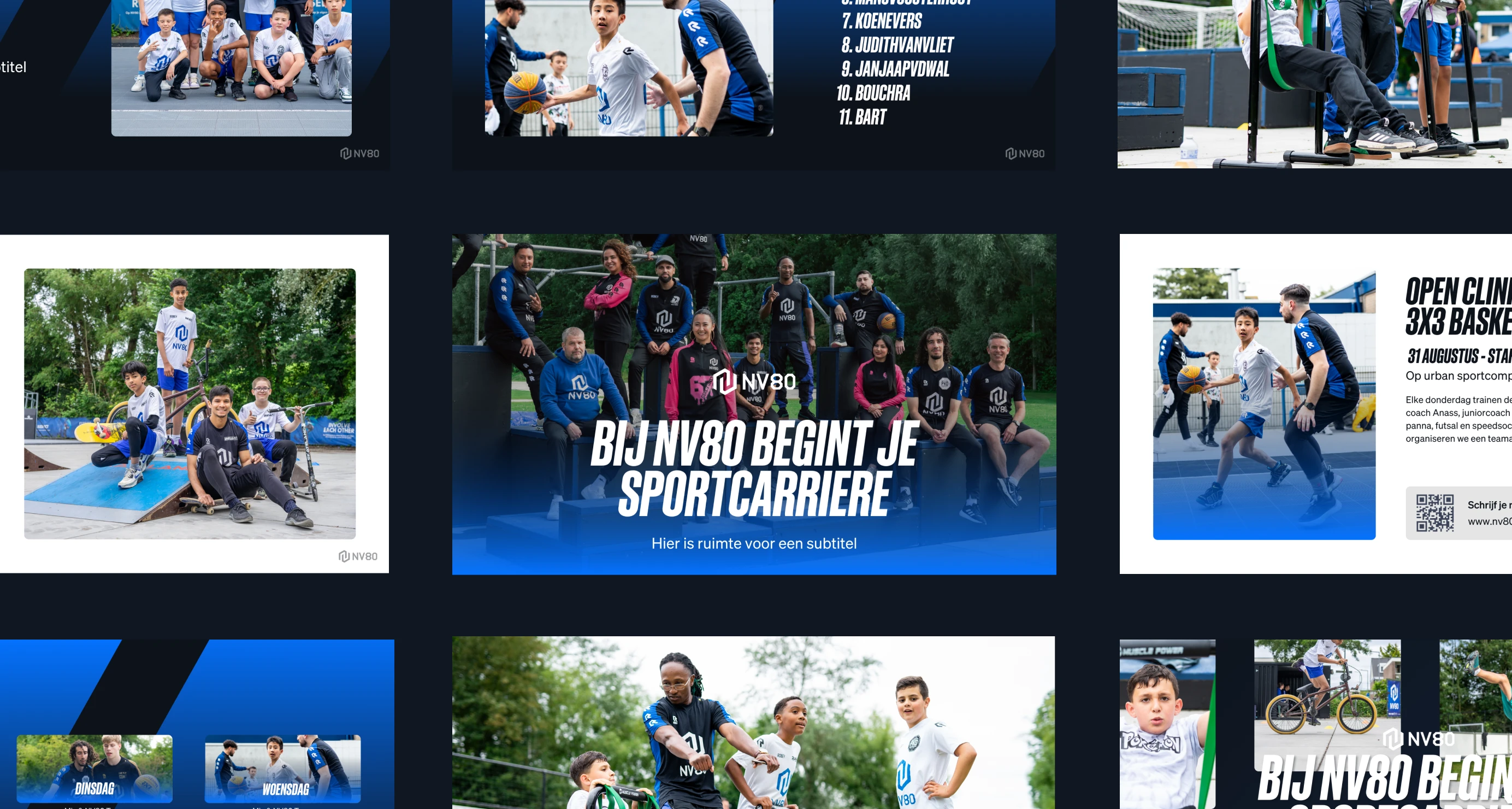
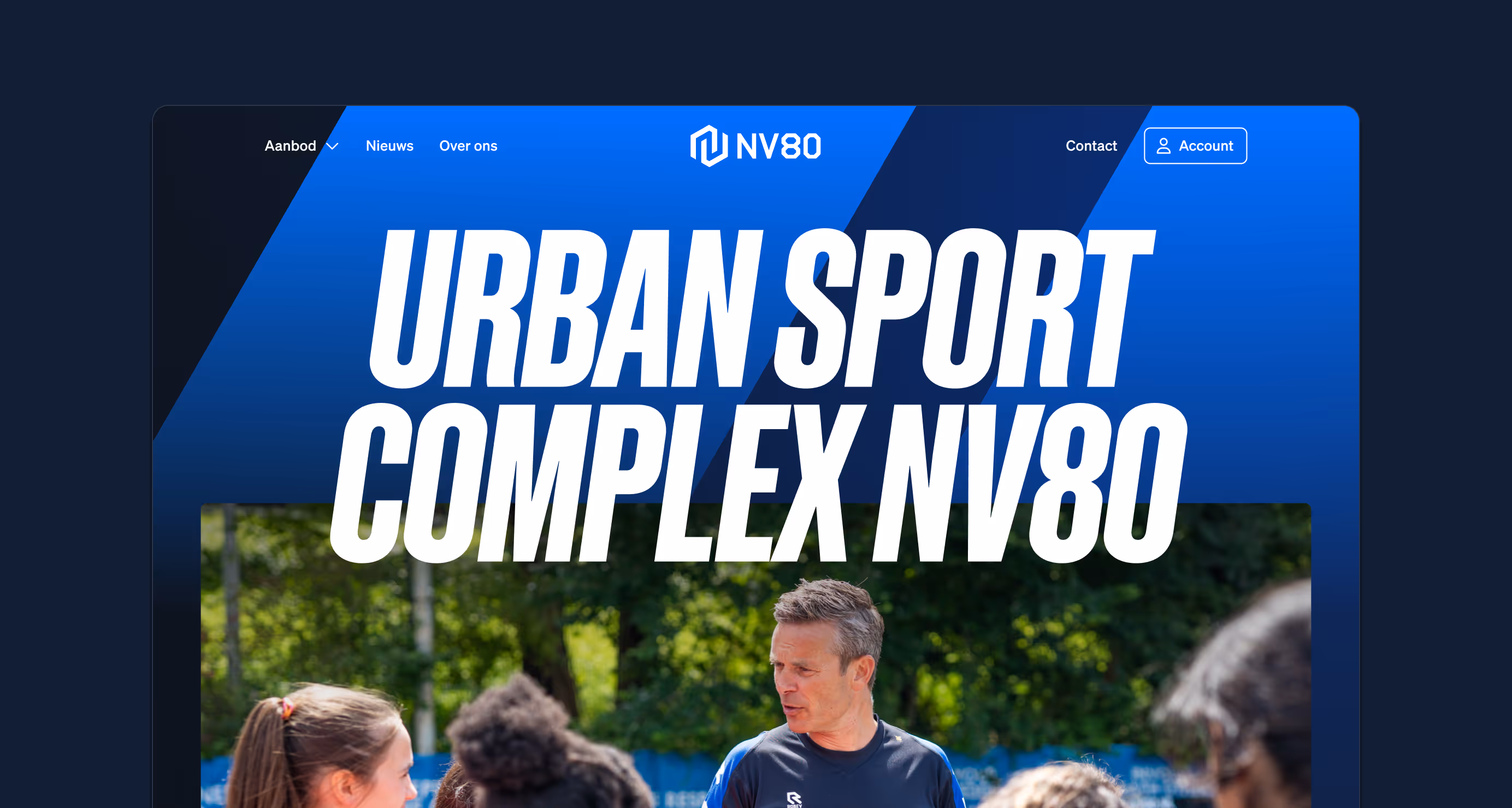
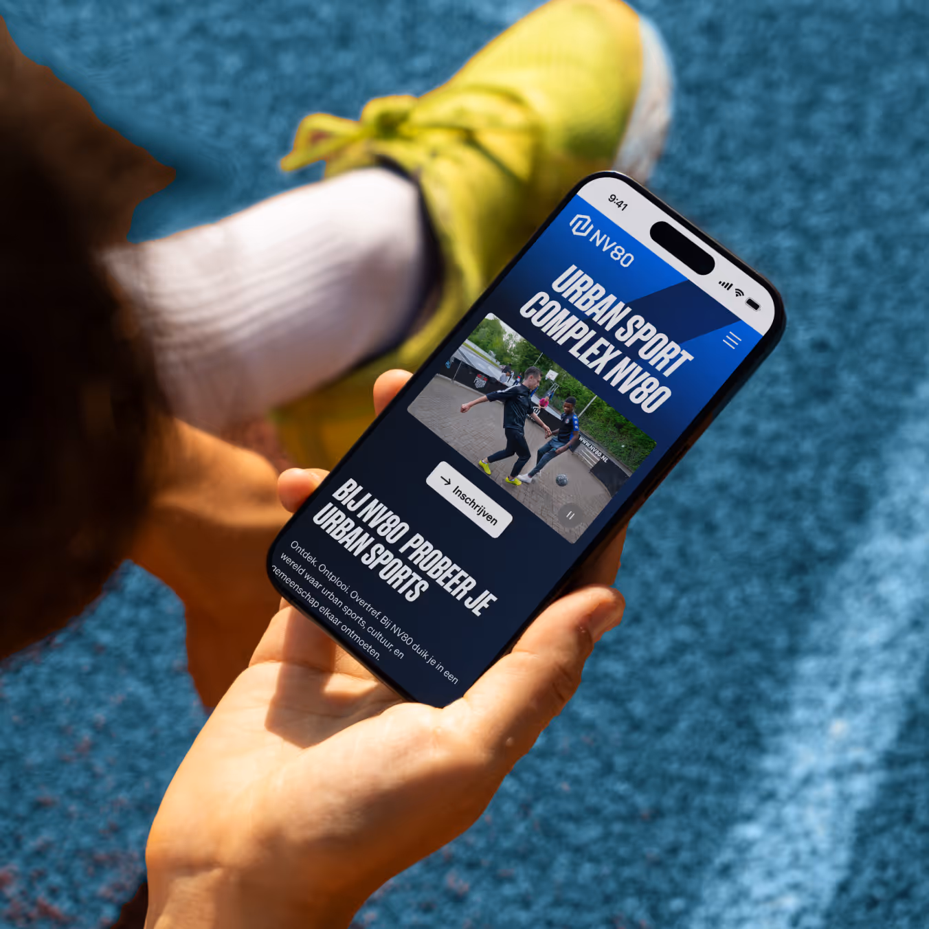
The new website continues that line as a digital version of the square outside. Open and direct. Simple structure, dynamic images, a tone that does not explain but invites. You can see what you can do, and you can participate right away. That's all this target group needs.
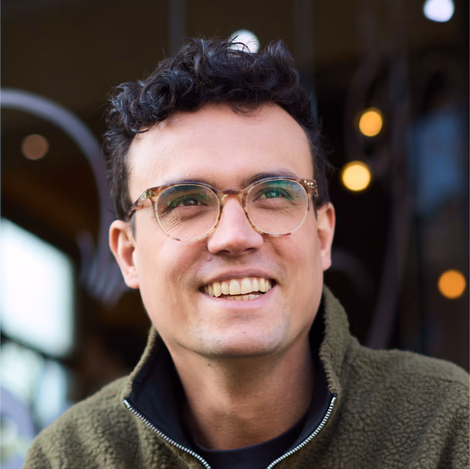
“The result is impressive, thanks to the professional process with EdG. After a creative kick-off on location, Ferry, Mans and Hidde remained flexible and thoughtful about changes and adjustments.”
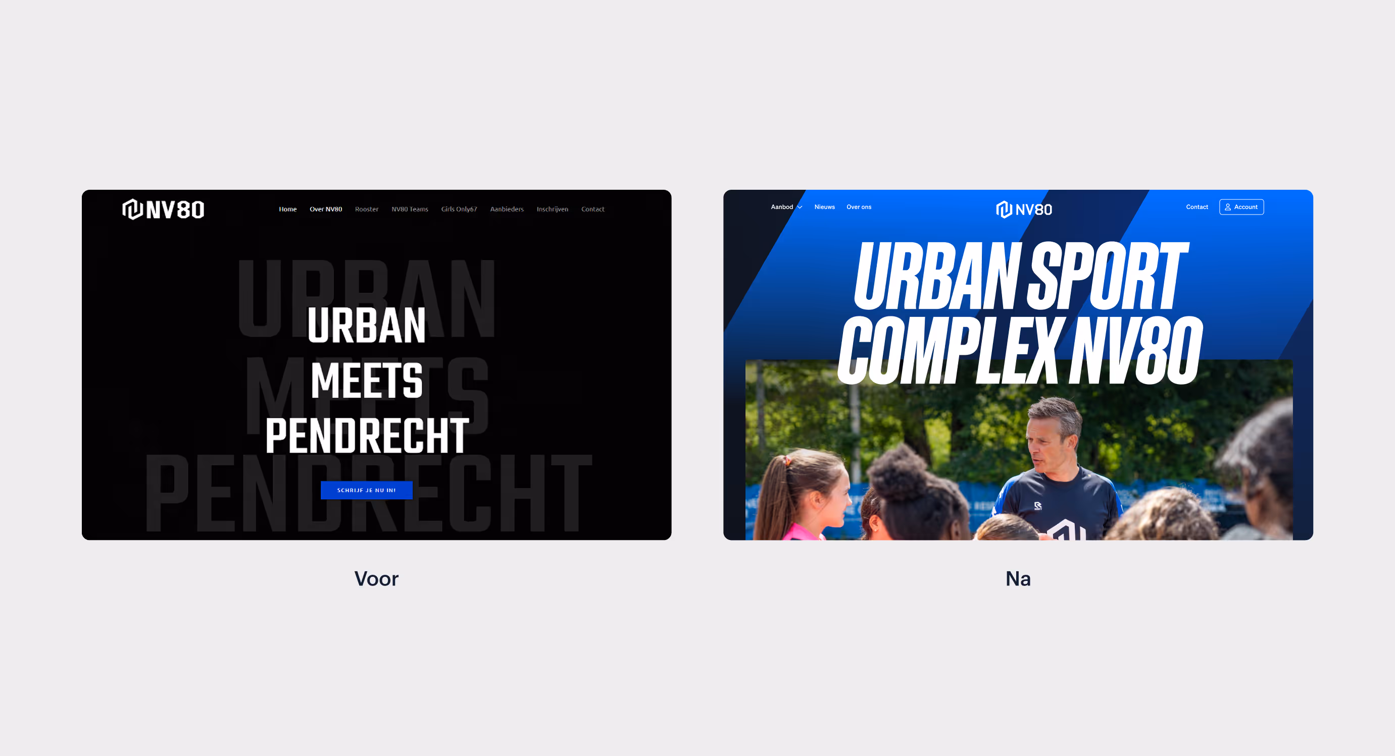
The designs went back to the community itself. In an Instagram poll, we showed several designs. Their response was clear. This is NV80! Just like that. The result is a brand that is embraced by the target group. NV80 now feels like the sports club you want to belong to.