Letters come to life
at Leeslab
Leeslab
Client
52
Unique illustrations
3
participating schools in Rotterdam
800
Children reached
What we did
Brand Strategy
Positioning
Visual brand identity
Illustration
Website
Webflow development
Brand book
Implementation

Leeslab is a social organization that works to make reading education at primary schools in Rotterdam more fun and effective. With the brand idea “Here letters come to life”, we want to inspire students to discover that every letter, word and sentence is a leap into a world of imagination where everything is possible.

Leeslab complete merkarchitectuur overzicht. Alle elementen van de visuele identiteit werken samen om de magie van lezen levendig te maken voor kinderen.
Leeslab website-secties met speelse layout en visuele hiërarchie. De design integreert illustraties en interacties die de fantasie van bezoekers prikkelt.
Leeslab visuele merkidentiteit: kleurrijke typografie en speelse illustraties in geel, blauw en paars. De merkidentiteit voor het leesplatform dat letters tot leven brengt voor kinderen.
Bringing the reading lab to life

At Leeslab, it's all about conveying the magic of reading to children. It's where they discover that reading can be as fun and immersive as watching Netflix or playing on the iPad.

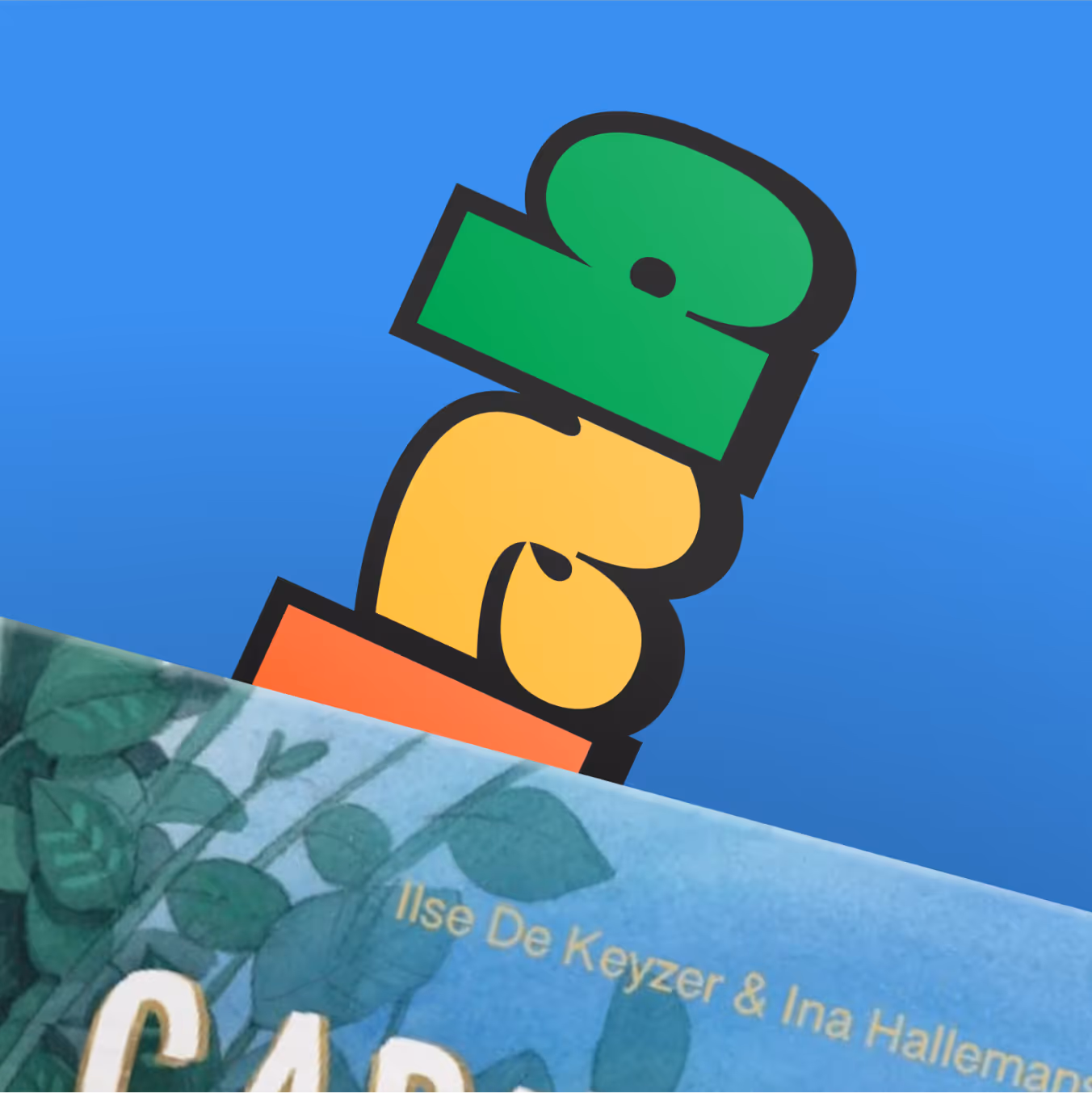
By positioning Leeslab as a magician, the brand idea “Here letters come to life” was created. Leeslab inspires kids to discover that every letter, word, and sentence is a leap into a world of imagination where anything is possible.

The playful visual identity, with bright colors and vivid illustrations by Marianne Lock, makes every touch with the brand a moment that stimulates and brings the imagination to life.

Leeslab raket-illustratie in geel en blauw als speels merkicoontje. Dit icoontje symboliseert de sprong in een wereld vol verbeelding van het Leeslab leesplatform.Leeslab merkboek-pagina met huisstijlrichtlijnen. Documentatie van de speelse visuele identiteit voor consistent merkgebruik op alle touchpoints.
Leeslab merktoepassing op drukwerk en online kanalen. De consistente visuele identiteit zorgt ervoor dat Leeslab zich onderscheidt en herkenbaar is voor leerlingen en leerkrachten.
Immersive website

The website fits seamlessly with the brand idea “Here letters come to life”. With playful interactions and surprising elements, the website not only draws attention, but also stimulates the visitor's imagination. Leeslab's mission and services are transferred to the target group in a clear and effective way, thanks to well-dosed and easy-to-understand content.

Leeslab branding collectie met illustraties en merktoepassing. Verschillende elementen tonen de levendige visuele identiteit van het leesplatform.
Leeslab website-design detail met interactieve elementen. De website sluit naadloos aan bij het brand idea met speelse animaties en duidelijke content.Leeslab website-landing met kindvriendelijke afbeeldingen. De website presenteert de missie en diensten van Leeslab op duidelijke en effectieve manier.
Sarah Leebeek
Program developer Leeslab

“Working with Evers + de Gier is a treat. From the first moment, we were actively involved in the design process and the end result exceeded our expectations. We look back on the collaboration with great pleasure.”

Leeslab illustraties in de karakteristieke kleuren geel, blauw en paars. De vrolijke illustraties van Marianne Lock maken het merk levendig voor de doelgroep kinderen.
Leeslab illustraties en typografische toepassing. De levendige artwork van Marianne Lock brengt het merkidee tot leven voor kinderen op basisscholen in Rotterdam.Leeslab website-ontwerp met speelse interacties en verrassende elementen. De website demonstreert het brand idea 'Hier komen letters tot leven' met kindvriendelijke navigatie.
Impact

Leeslab makes a visible difference at primary schools in Rotterdam. By making reading fun and accessible, they inspire children to learn with confidence and joy. The playful, visual character of the brand motivates both students and teachers. With each lesson, Leeslab not only brings the magic of reading to life, but contributes to the future of hundreds of Rotterdam children.

Leeslab merktoepassing op marketing- en onderwijsmateriaal. De speelse visuele identiteit maakt van elke aanraking met het merk een moment dat de fantasie prikkelt.
Thanks to

Big high five to the Leeslab team, and in particular Dorieke Hammink and Sarah Leebeek, for the space to go that extra mile! And a special thanks to Marianne Lock for the fantastic illustrations, thanks to you, the brand really comes to life!

Want to build a distinctive brand too?
Close Cookie Popup
Cookie preferences
By clicking “Accept All”, you agree to the storage of cookies on your device to improve site navigation, analyze site usage, and assist with our marketing efforts, as described in our privacy policy.
Necessary (always active)
Cookies that are necessary to enable the basic functionality of the website.
Cookies that are used to understand how the website is performing and whether there may be technical issues.
Cookies used to display ads that are relevant to your interests.
Cookies that allow the website to remember choices you make (such as your user name, language, or region you are in).
Portretfoto van Koen Evers, Co-founder en Brand Director bij Evers + de Gier
Portretfoto van Mans van der Drift, designer bij Evers + de Gier
Get to know us

Have a great idea, a question, or just want to know who we are? Get in touch.

Get in touch
And tell us about your idea