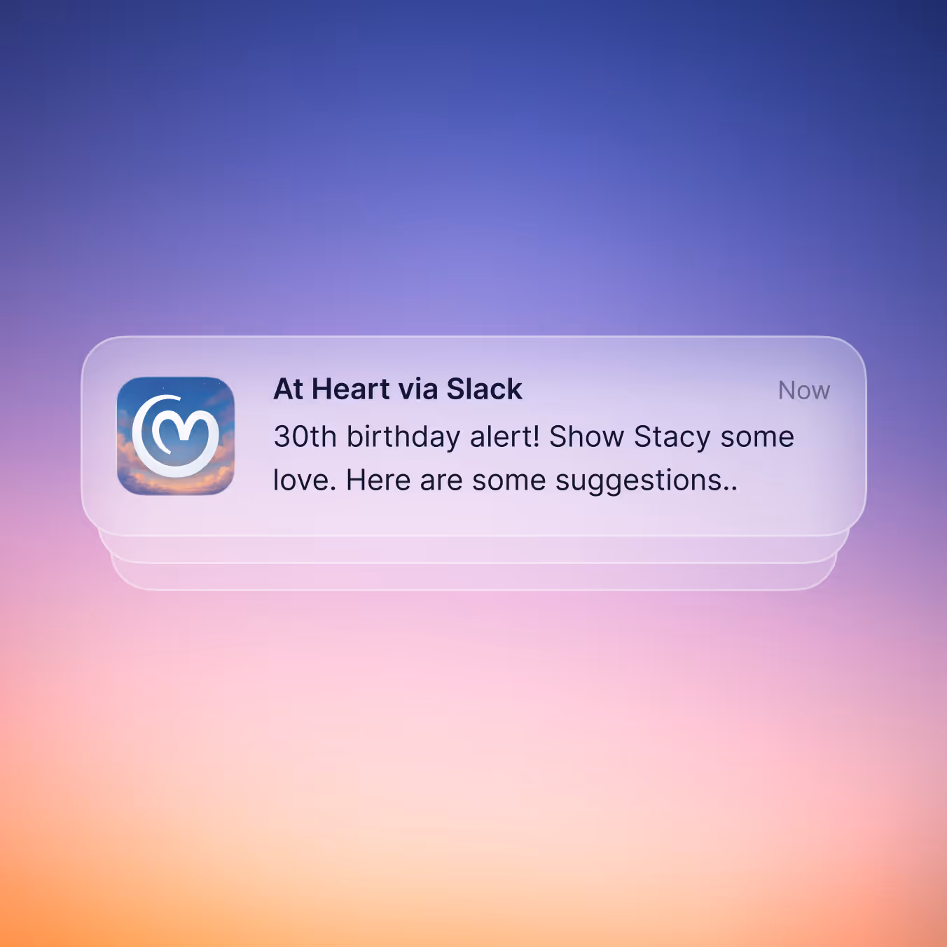
At Heart is a lightweight HR tool for SMEs that ensures that everyday moments such as birthdays, anniversaries and evaluations are automatically delivered at the right time. Employees feel seen without the need for manual work. For this new brand, we built everything from scratch: brand strategy, visual identity, website and product design.
Humanoids, a UX studio based in Rotterdam and Amsterdam, worked on At Heart: a lightweight HR tool that automates everyday employee moments such as birthdays, work anniversaries, reviews, and contract milestones. The product idea was clear, but there was no brand, no visual identity, and no website.
The positioning challenge was significant. We mapped 19 competitors across two axes: technical complexity versus simplicity, and functional versus emotional positioning. The result showed a crowded middle ground. Tools like HiBob, Personio, and Lattice sit firmly in the complex, functionally positioned space. On the lighter end, players like Homerun and HoorayHR exist, but even there the visual language is safe and interchangeable: blue-and-white palettes, generic illustrations, corporate messaging.
At Heart needed to claim a space no one truly owned: lightweight and emotionally positioned. Simple enough for an SME owner to set up in minutes, but with a brand personality that actually resonates.
We ran brand sessions to define what fundamentally sets At Heart apart. This is not a KPI dashboard or a performance management suite. It is the quiet force behind a healthy company culture: making sure the small but meaningful moments, like a birthday, an anniversary, or a timely check-in, happen automatically, without relying on memory or a full-time HR role.
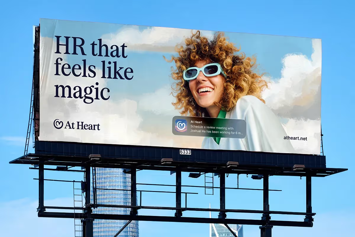
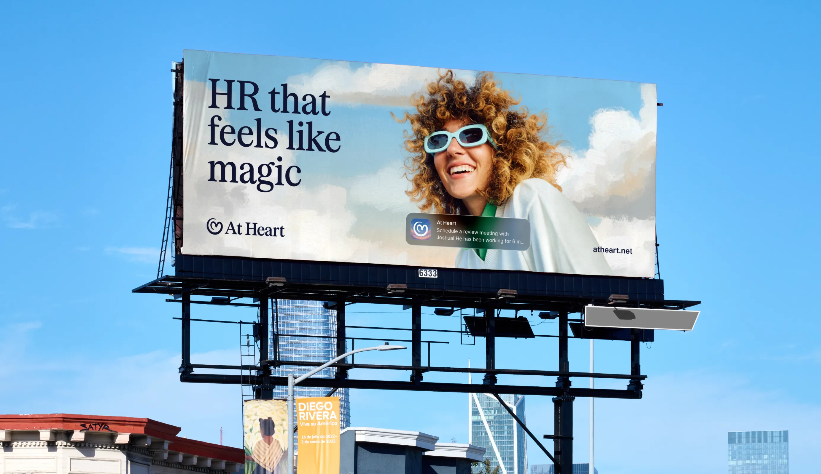
This insight became the brand idea: “Everyday Magic”. The magic is not in big gestures, but in small, well-timed moments of attention that happen effortlessly.
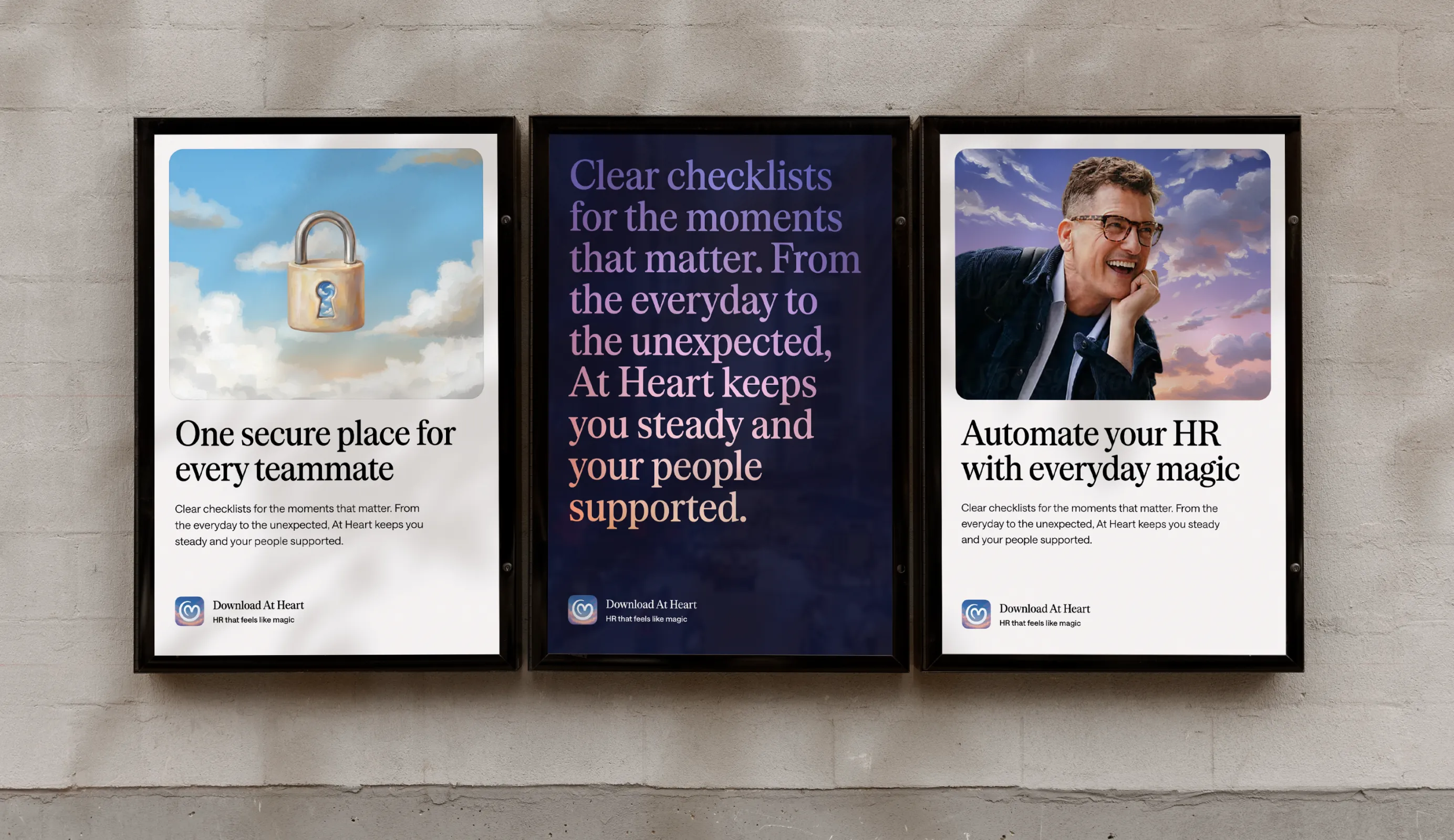
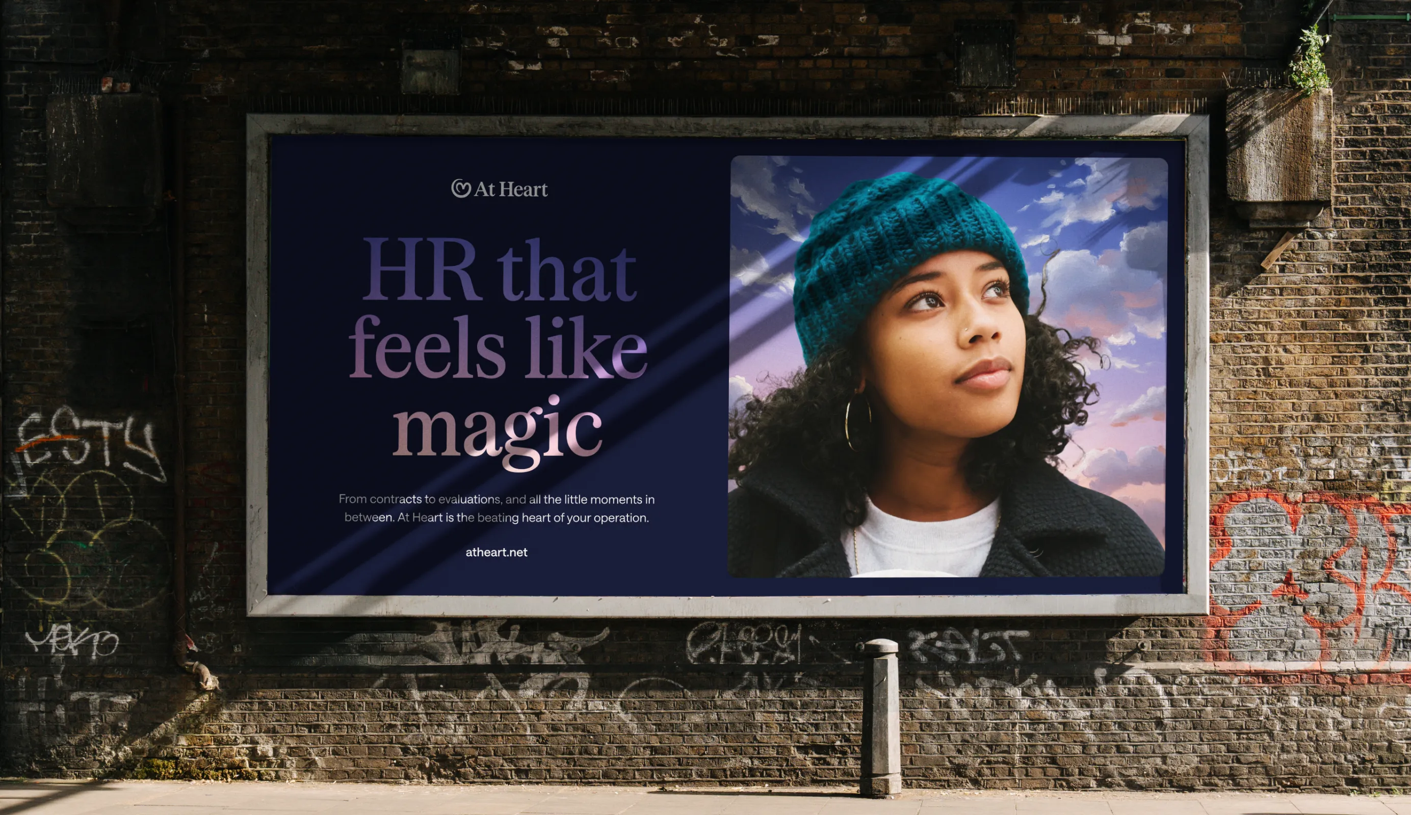
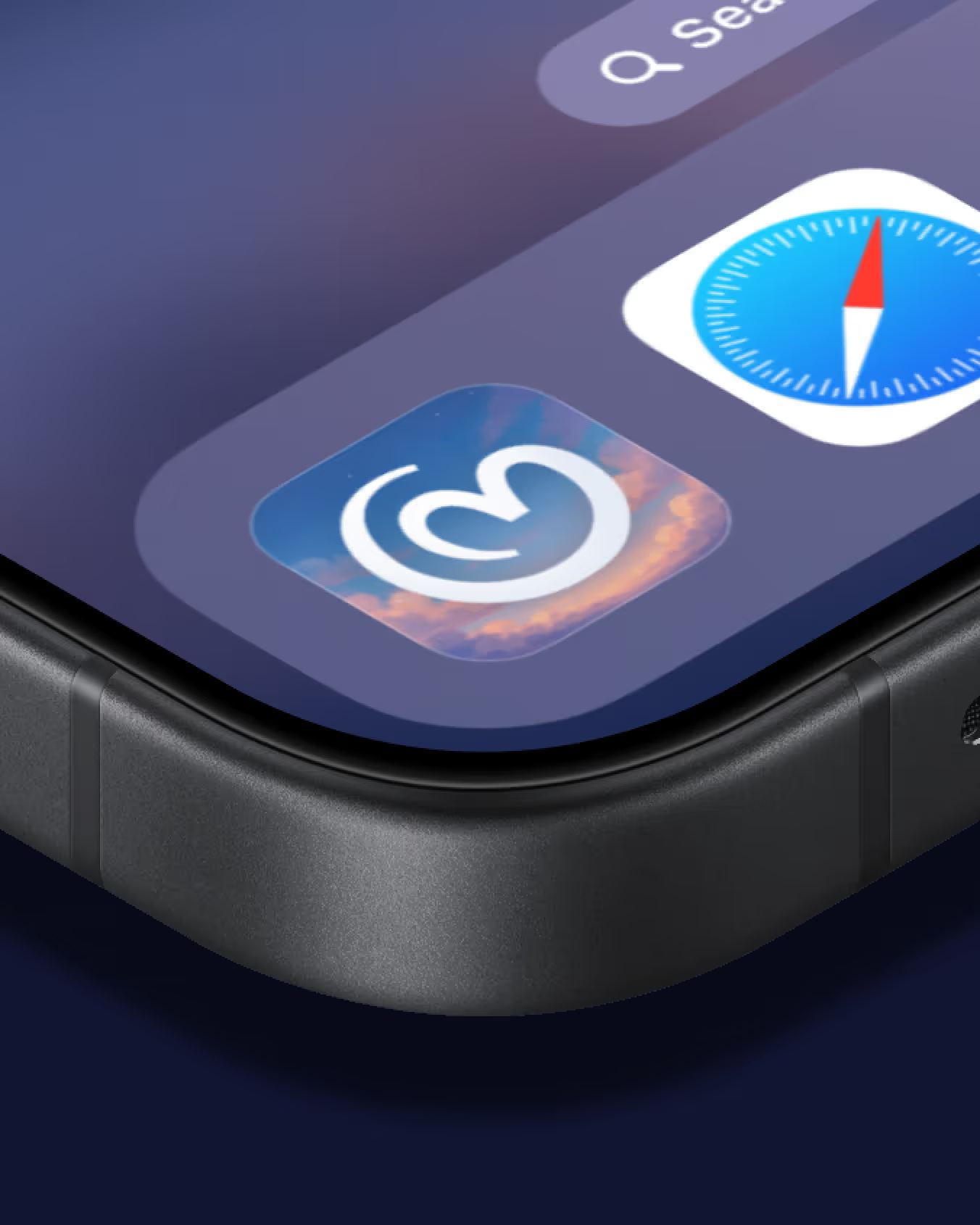
We built the brand around a combination of the hero and magician archetypes for the buyer. The product is powerful, simple, and takes work off your hands. On top of that, we layered a caregiver perspective for employees experiencing the result: feeling seen, valued, and acknowledged. The visual identity translates this into romantic, painterly skies and dreamlike iconography, deliberately contrasting the clinical aesthetic that dominates most HR tech.
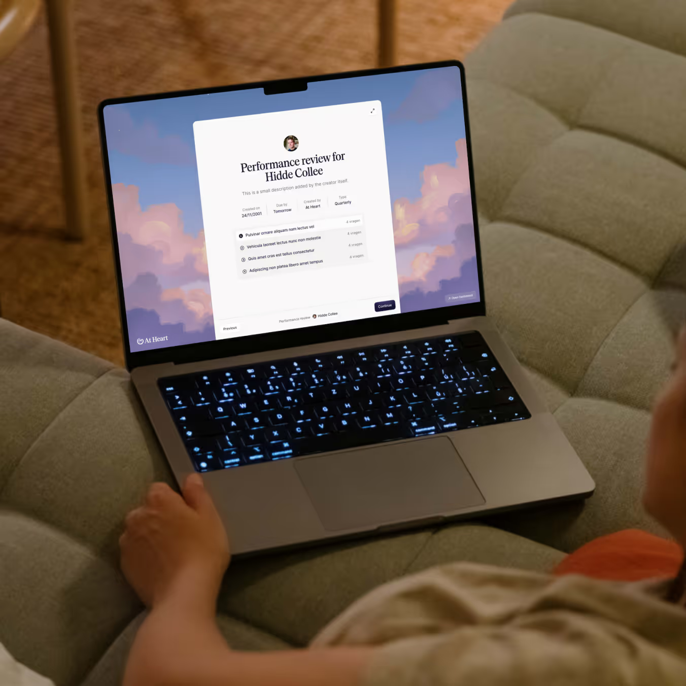
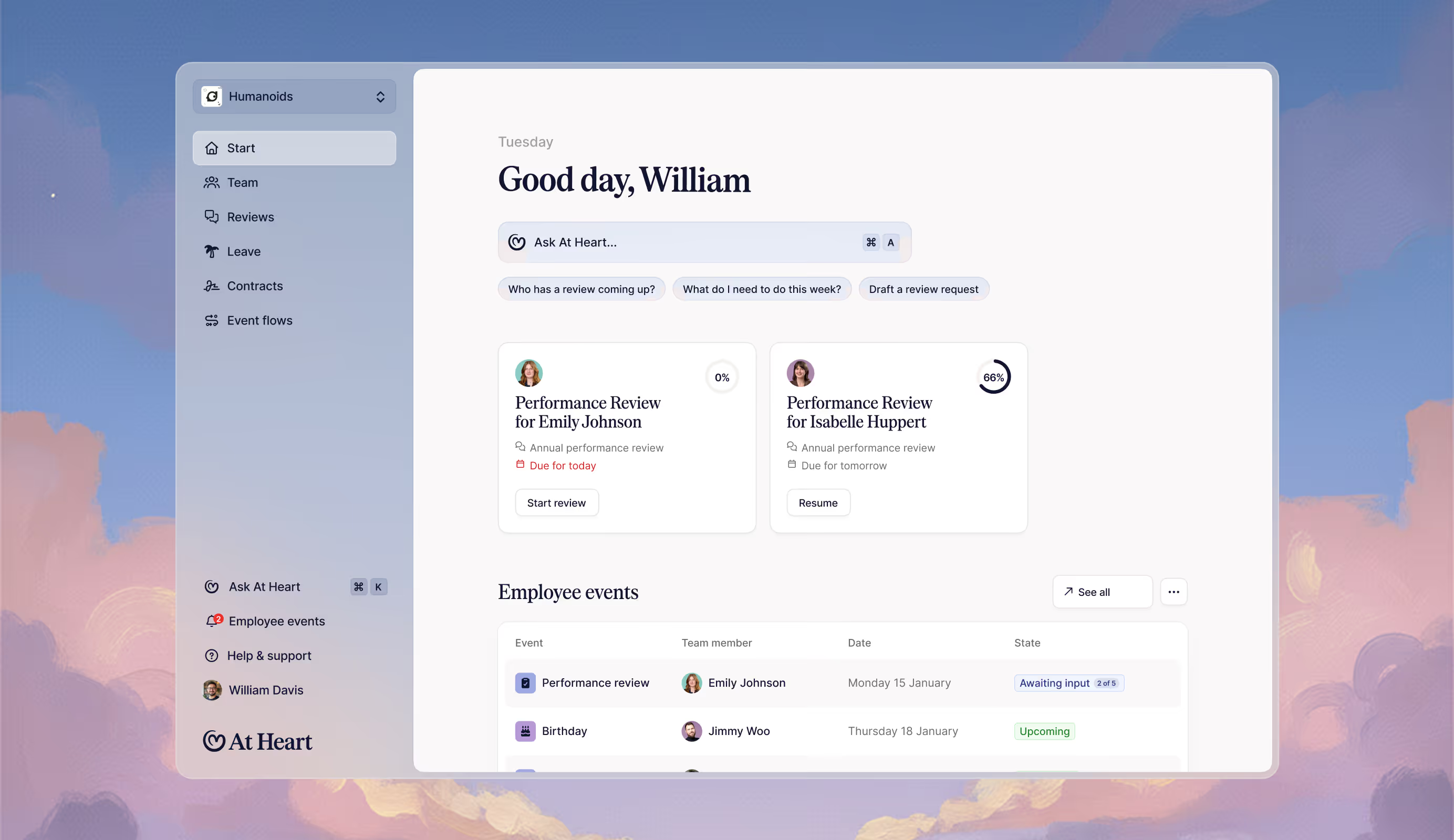
From there, we designed the marketing website, social templates, and the full product UI. The brand idea is embedded in every touchpoint, from micro-interactions during onboarding to the design of buttons in the employee dashboard. Brand and product design ran in parallel rather than sequentially, allowing us to move from initial sessions to final designs in eight weeks.
At Heart launched with a consistent brand experience across all touchpoints. Within a competitive landscape, it now occupies a position no other player truly owns: emotionally driven, lightweight, and visually distinct.
Because one team handled both brand and product, there was no translation gap. The website, social presence, and product interface all speak the same language. For Humanoids, this meant launching not just a functional tool, but a brand that holds its own alongside Silicon Valley products.
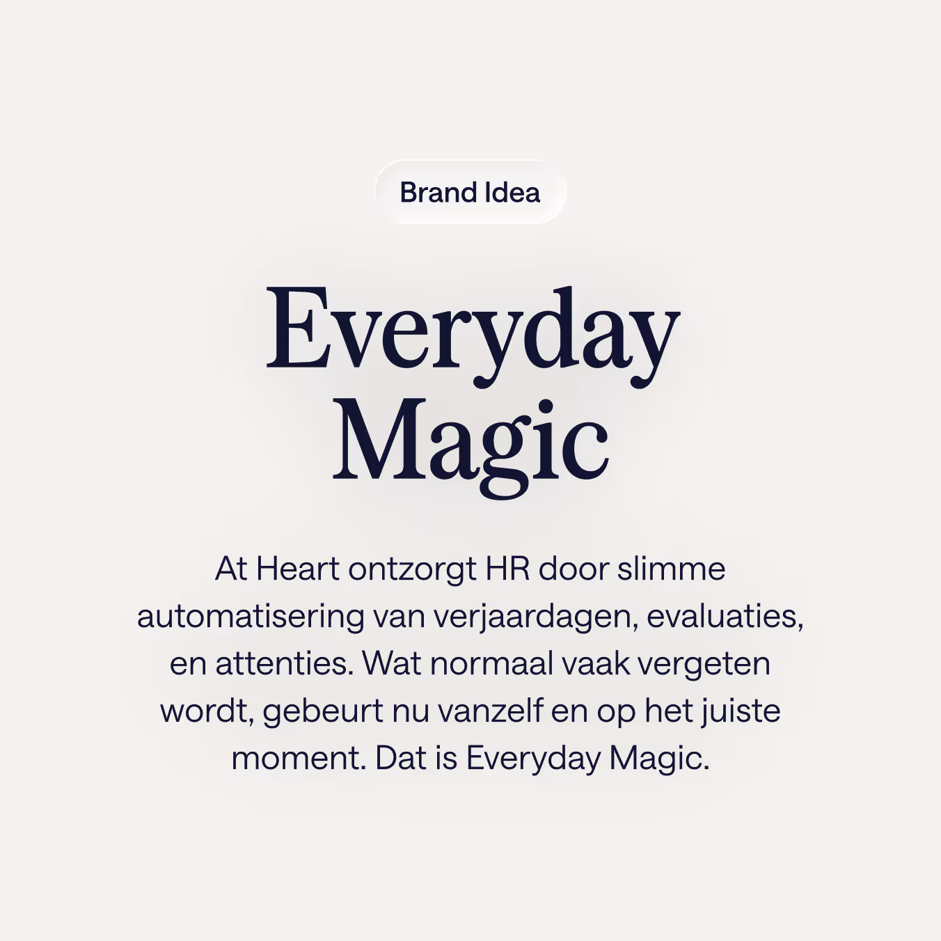
The brand strategy sessions gave birth to the brand idea 'Everyday Magic': the magic isn't in big gestures, but in that little bit of attention, at the right moments.
A visual competitive analysis showed that the HR market is quite monotonous. We grabbed that opportunity. At Heart's visual identity is built around Romantic skies and icons in a painterly style that refers to the magic in everyday moments.
That calm style is carried through consistently across all touchpoints. On the website, the visual language sets the tone immediately: optimistic and human. In the product interface, the brand idea translates into the details of the UI, making the tool feel like part of the same story. One consistent brand experience, from first impression to daily use.


As seen on Beautiful Branding
As seen on Outstanding Branding