Cresco Spine develops medical solutions for children with Early Onset Scoliosis. Their core product, the Spring Distraction System®, is a dynamic system that moves continuously with the spine as the child grows. It offers an alternative to the invasive, repeated surgical procedures traditionally required for this condition. We developed the entire brand identity for this company: from strategy to visual identity, illustration style, mascot, and their implementation.
Children with EOS are typically treated with techniques that restrict their growth and require numerous repeat surgeries. This is taxing for both the child and the surgeon. The sector is technical, invasive, and rarely child-centric. Communication is almost always aimed at the surgeon, clinical in tone, with little regard for the child undergoing the treatment.
Cresco believed there was a better way. A solution that moves with the body, rather than forcing the body to adapt to the treatment. Requiring only one surgery instead of annual procedures, it gives children much more freedom to simply be children. The challenge was to translate that conviction into a distinctive brand identity that simultaneously radiates warmth and trust to both children and parents.
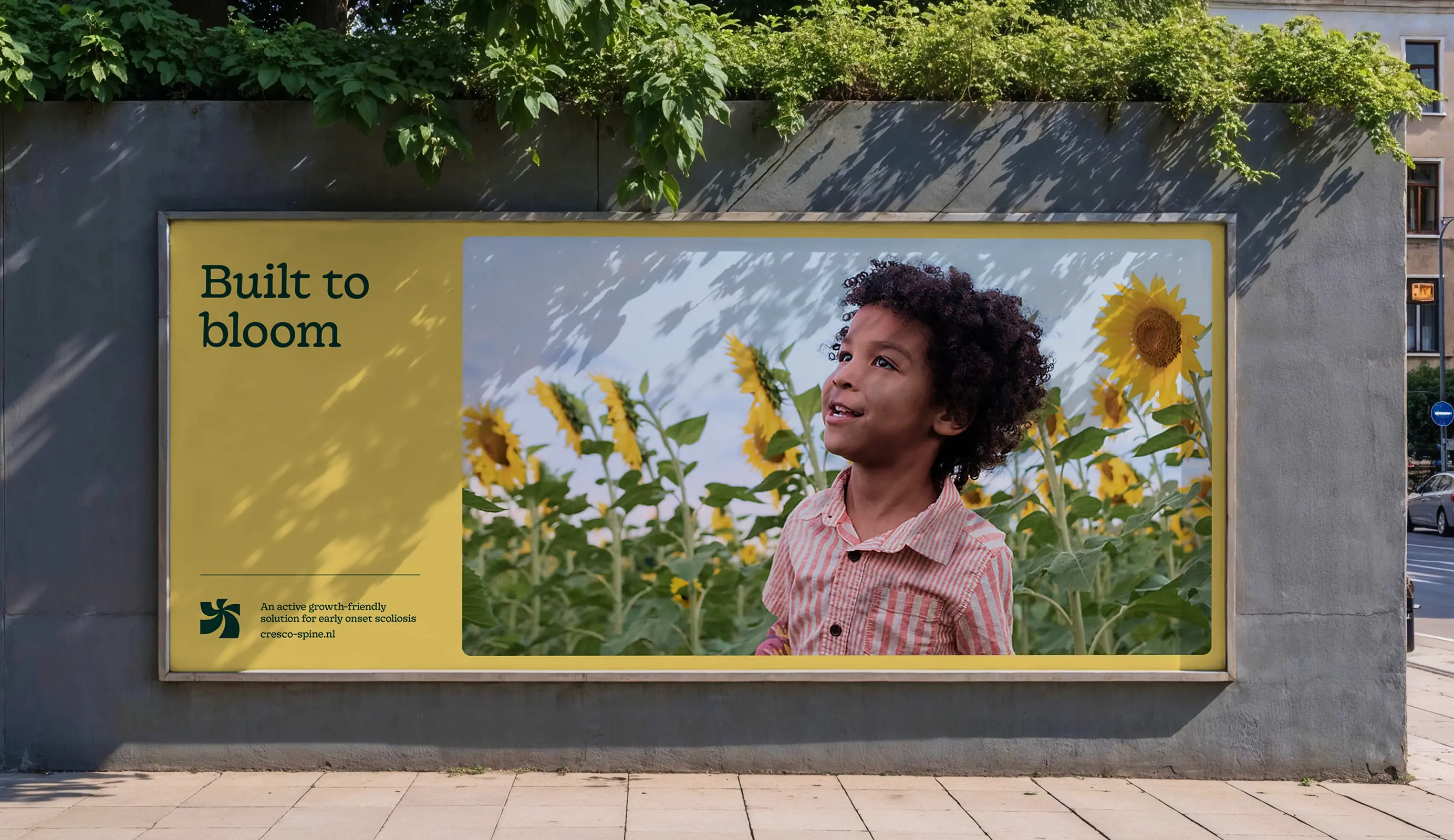
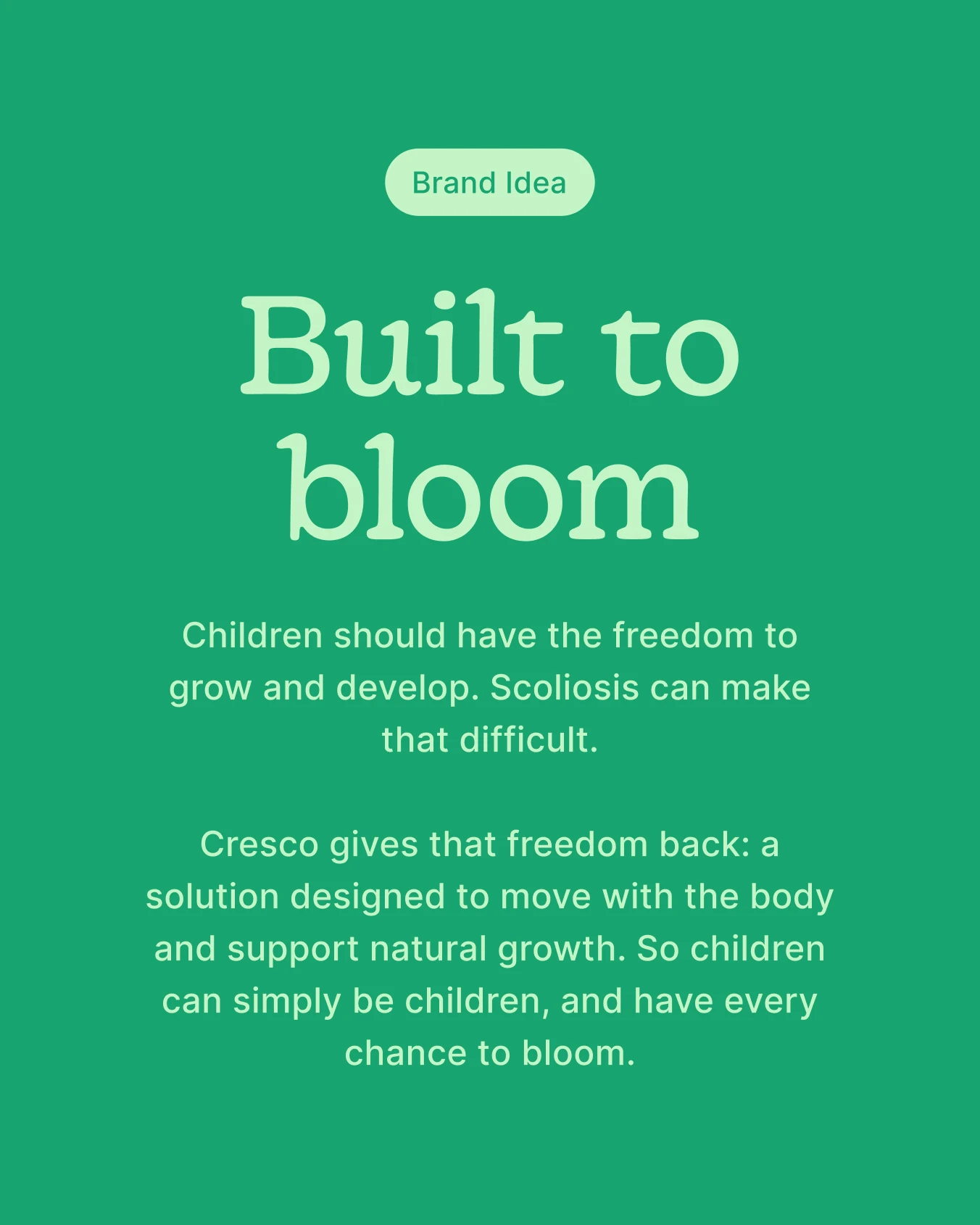
We built the brand from a brand canvas of insight, vision, role, and evidence: why current treatments fall short, what Cresco believes in, and how it acts accordingly. This led to the brand idea "Built to Bloom." Cresco gives children the space to develop freely and fully blossom, just as a child should be able to do.
That idea took shape in a logo with a dual layer. It refers simultaneously to a flower and a playing, jumping child, playing on the meaning of "spring"—the component that technically defines the product.
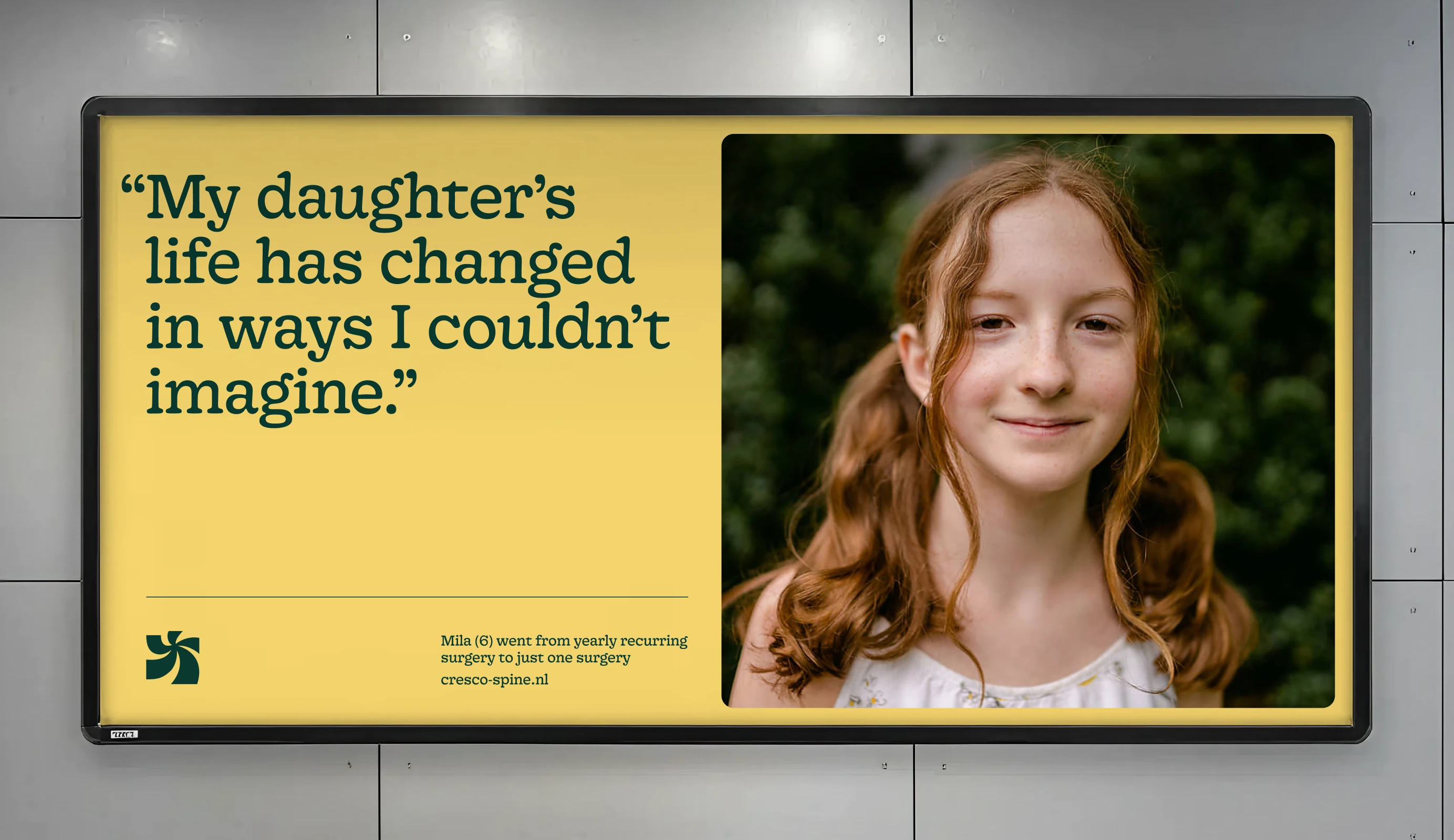
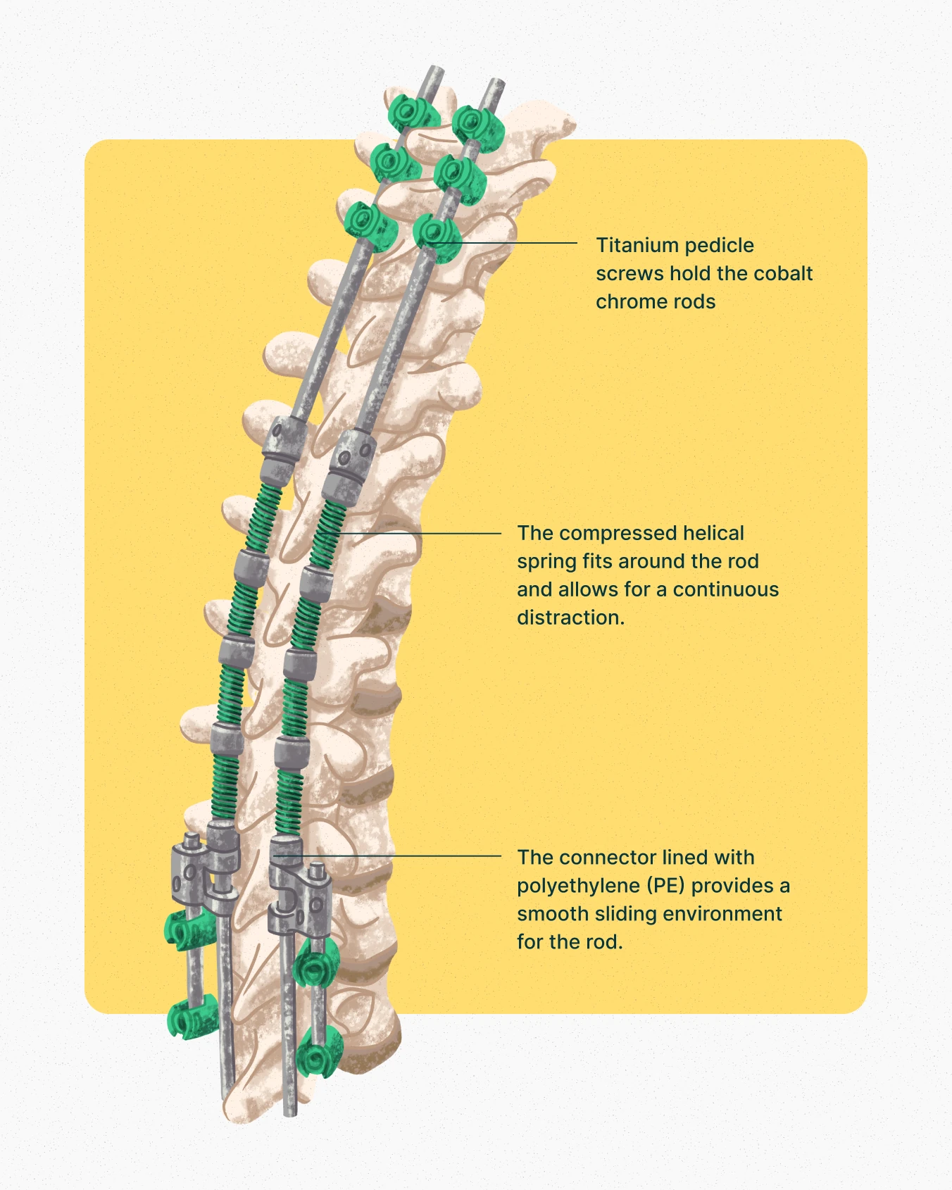
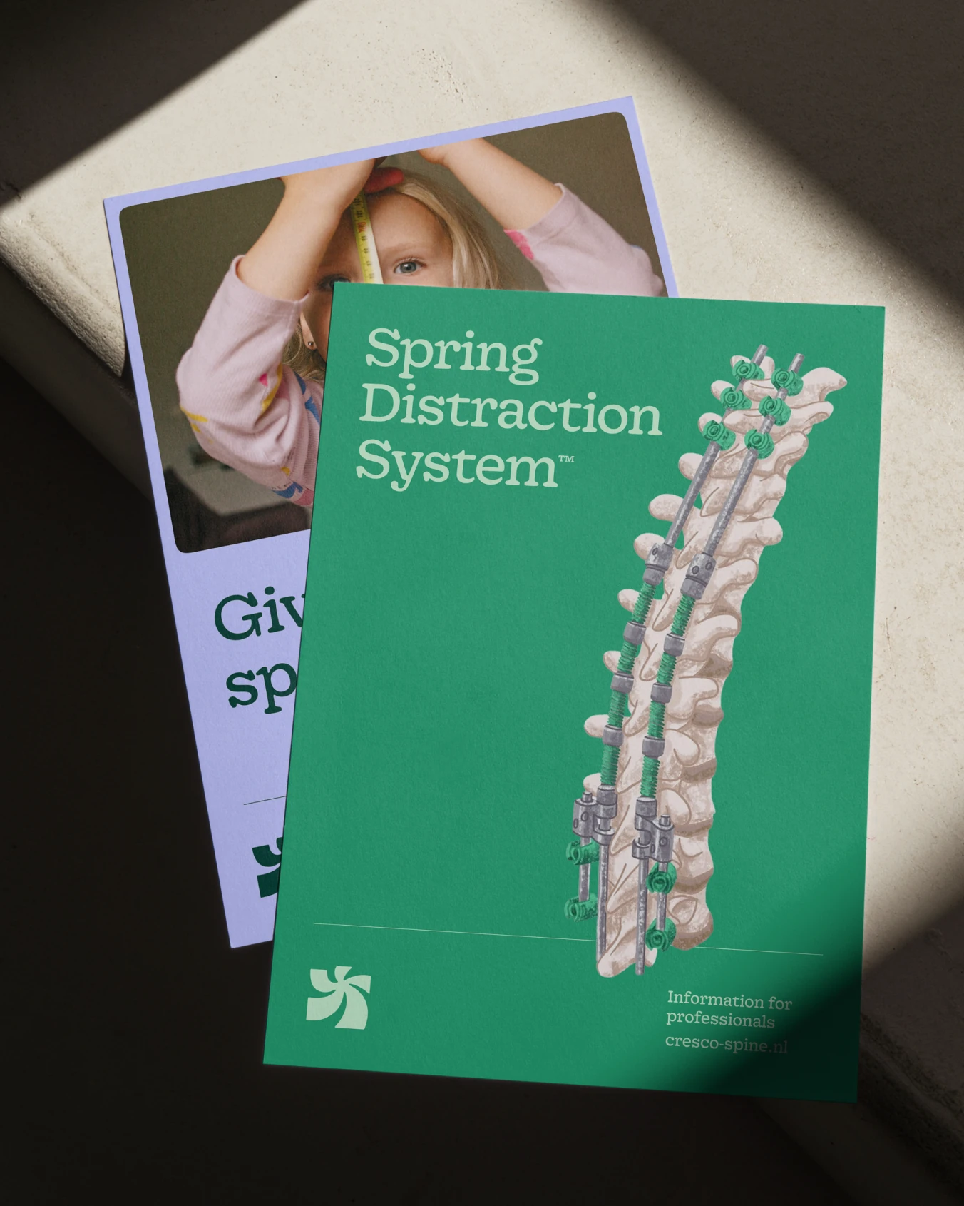
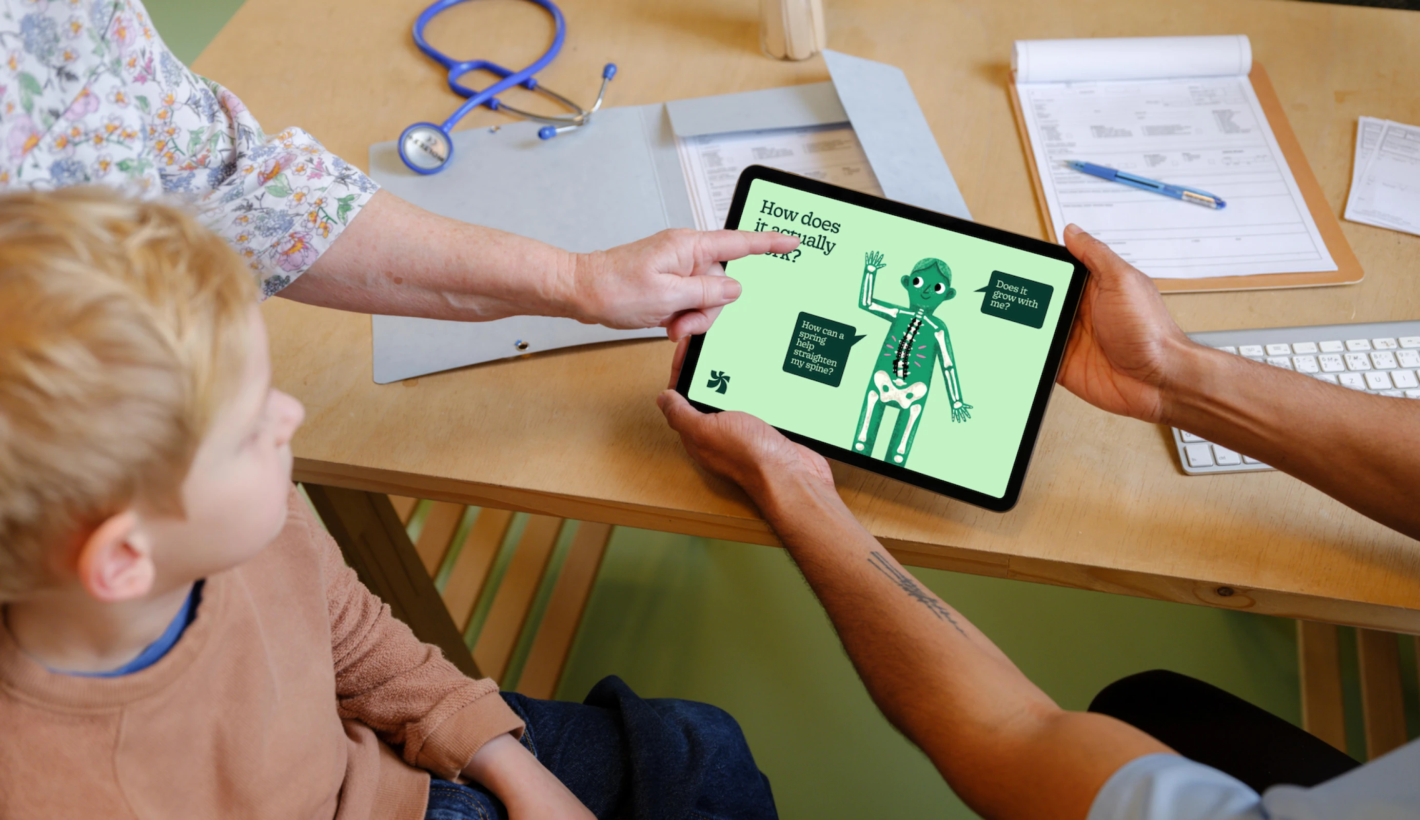
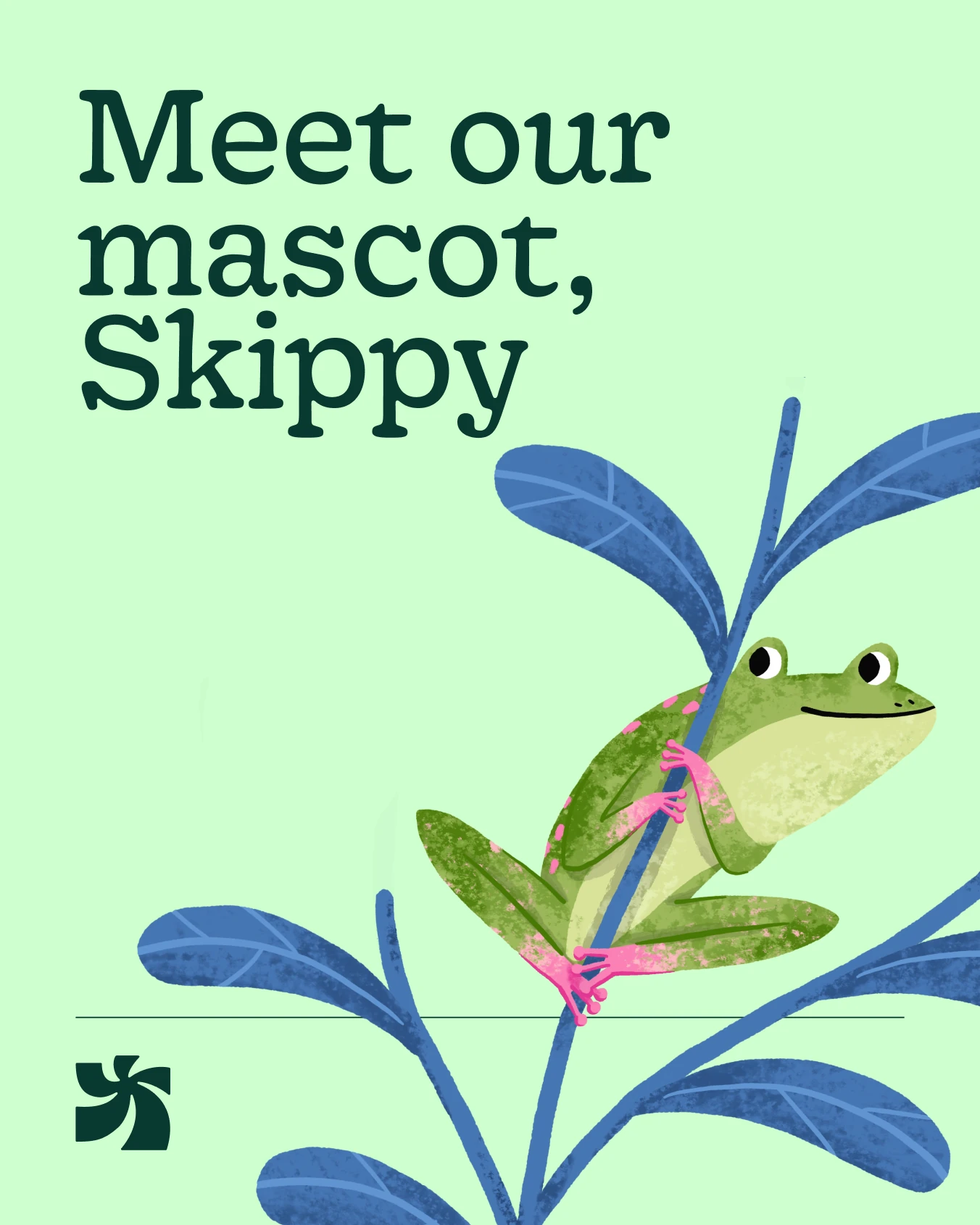
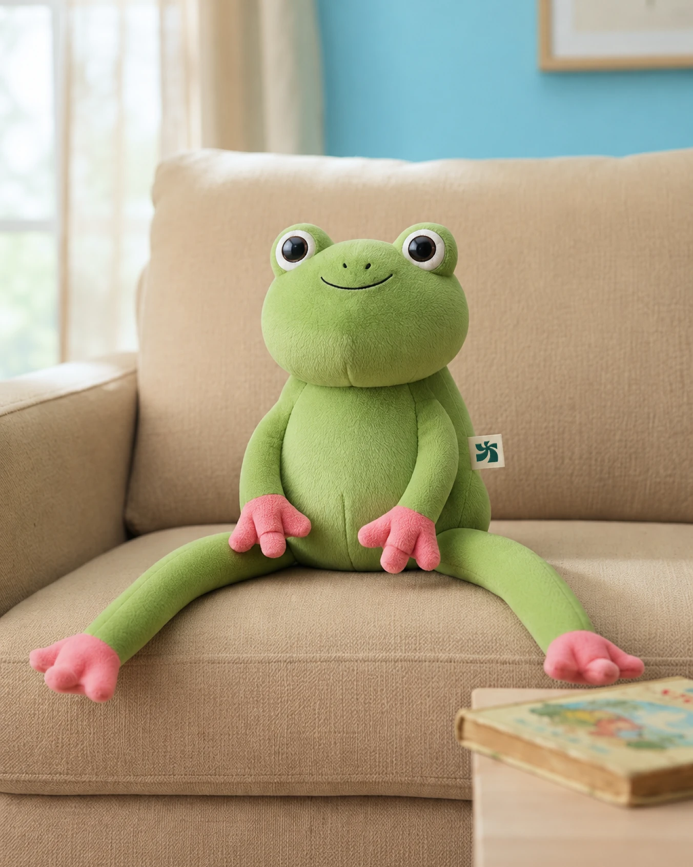
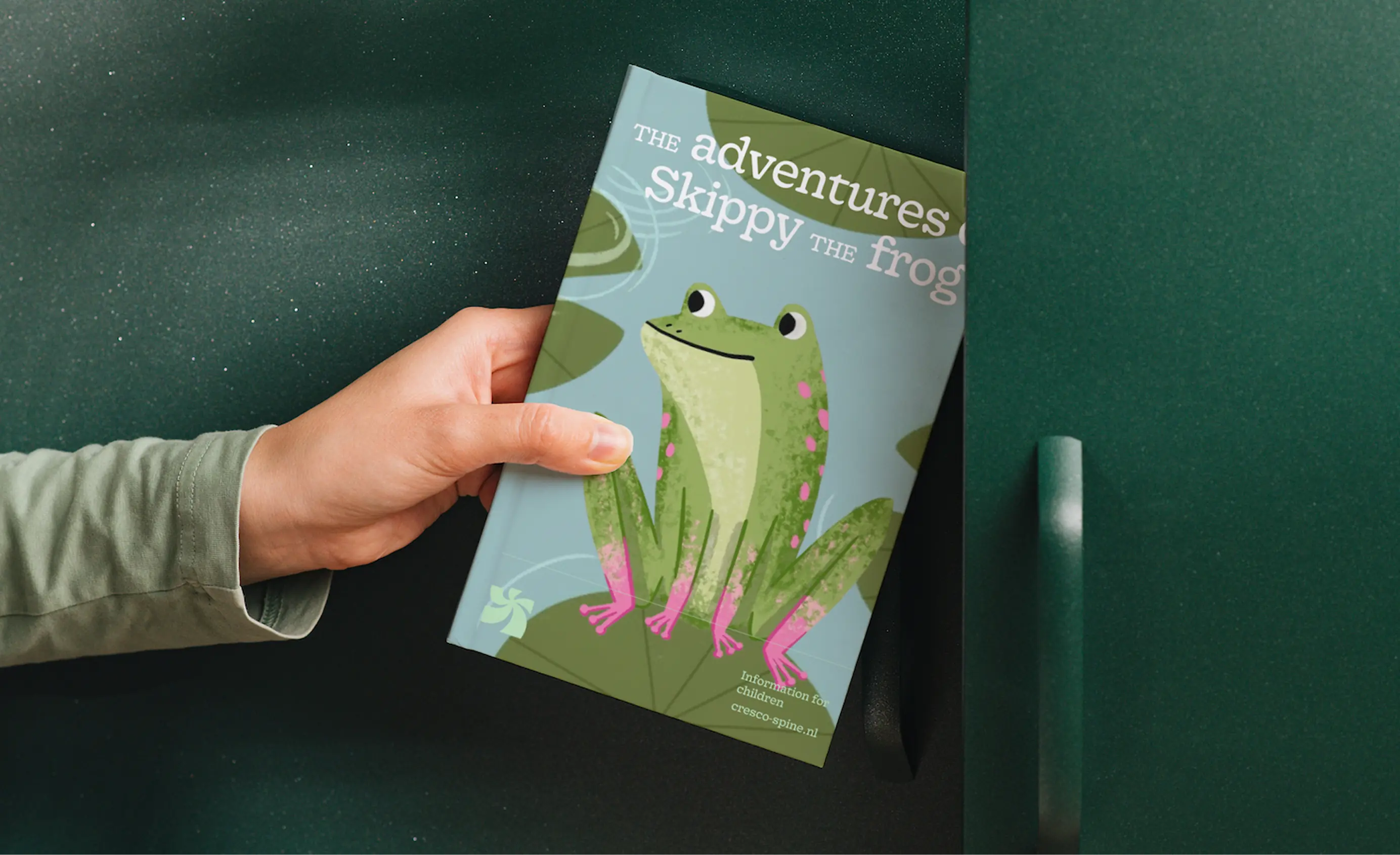
Because Cresco serves three very different target audiences, we developed a unique language for each within the same brand. For surgeons and professionals, we created clinically substantiated product information, supported by a unique illustration style for product visualization—a departure from the standard 3D renders used by competitors. For parents, we crafted a reassuring message centered on "Giving children space to bloom," combined with optimistic photography of children in natural, outdoor settings. For children, we introduced Skippy the frog, a mascot symbolizing resilience and playfulness, providing explanation and relatability without focusing on illness or surgery. These three layers come together in the application across the website, product visuals, and social/LinkedIn content, all within one recognizable brand.
Cresco has strengthened its position as a leading party in the sector, now supported by a unique visual identity. "Built to Bloom" gives the brand a foundation that goes beyond a logo. It guides how Cresco behaves in every communication, from product explanations to social content. In doing so, Cresco establishes itself as a striking, pioneering player in the EOS treatment market. It is a brand that visibly puts the child at the center—something almost no one else does—while remaining taken seriously by the surgeons who must rely on it.
Thanks to Nancy Lamerigts, Dennis Magermans, and Luca Eekhof for their trust and for the great collaboration. Thanks to Marianne Lock for creating the beautiful illustrations.