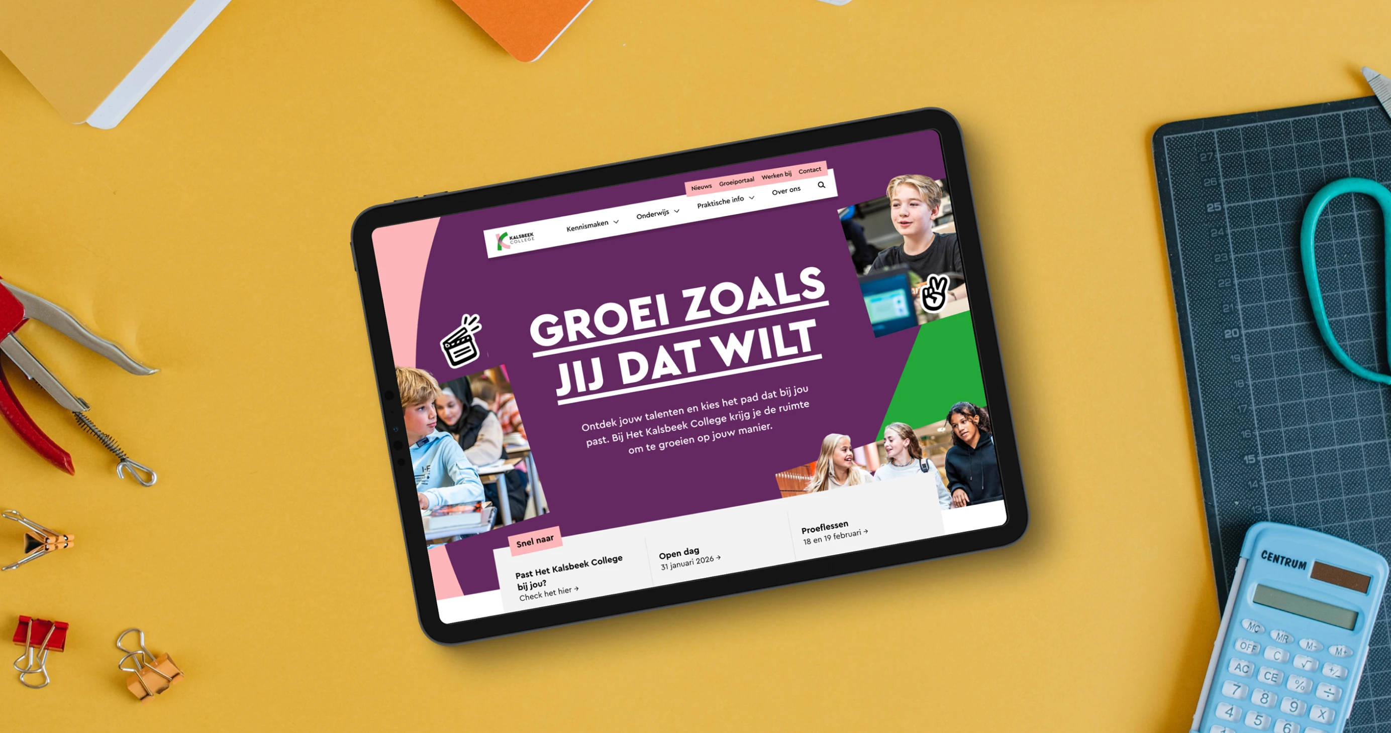
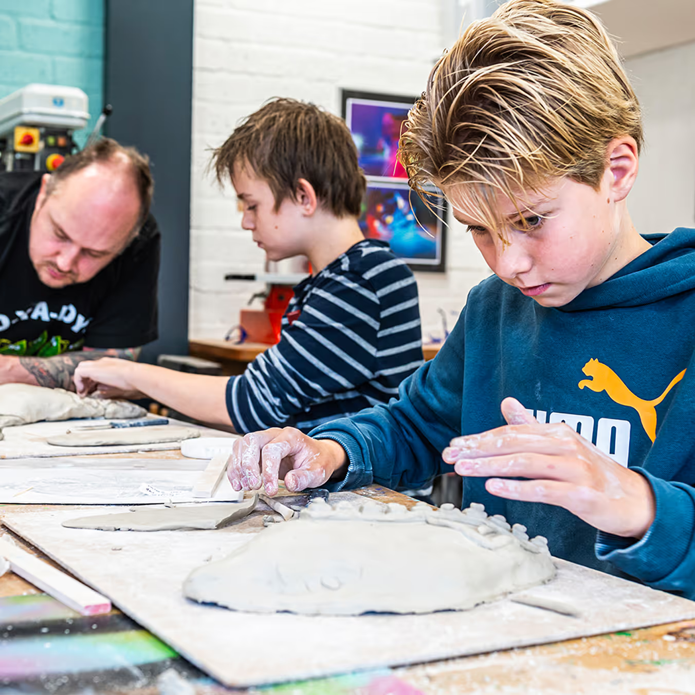
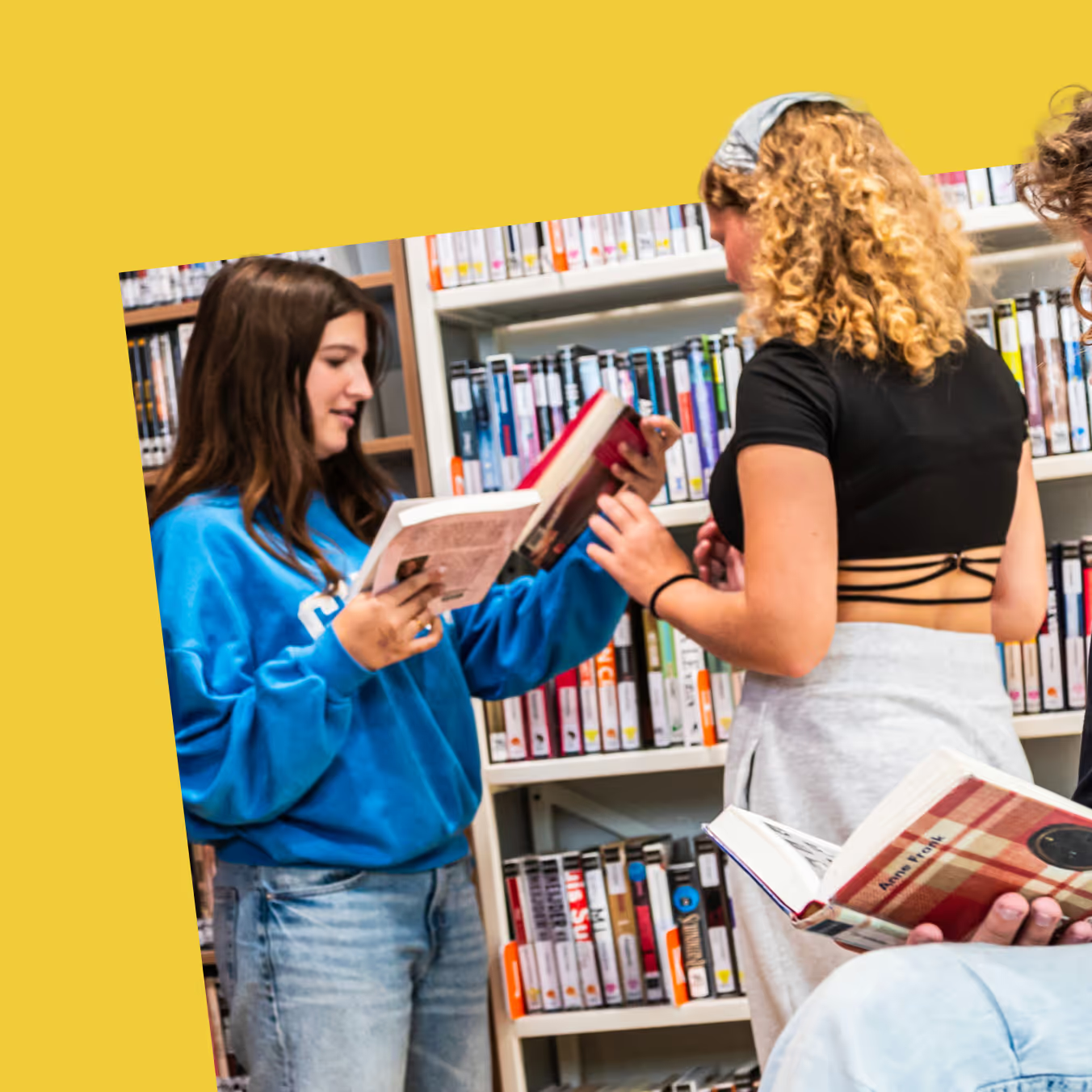
You choose a secondary school not only with your head, but above all, with your gut feeling. Kalsbeek College is a school where there is space for who you are and who you want to become. That belief deserves an online environment that matches that. Together with Kalsbeek, we designed a website that communicates clearly, navigates smartly and makes the broad school identity really tangible for parents and new students.
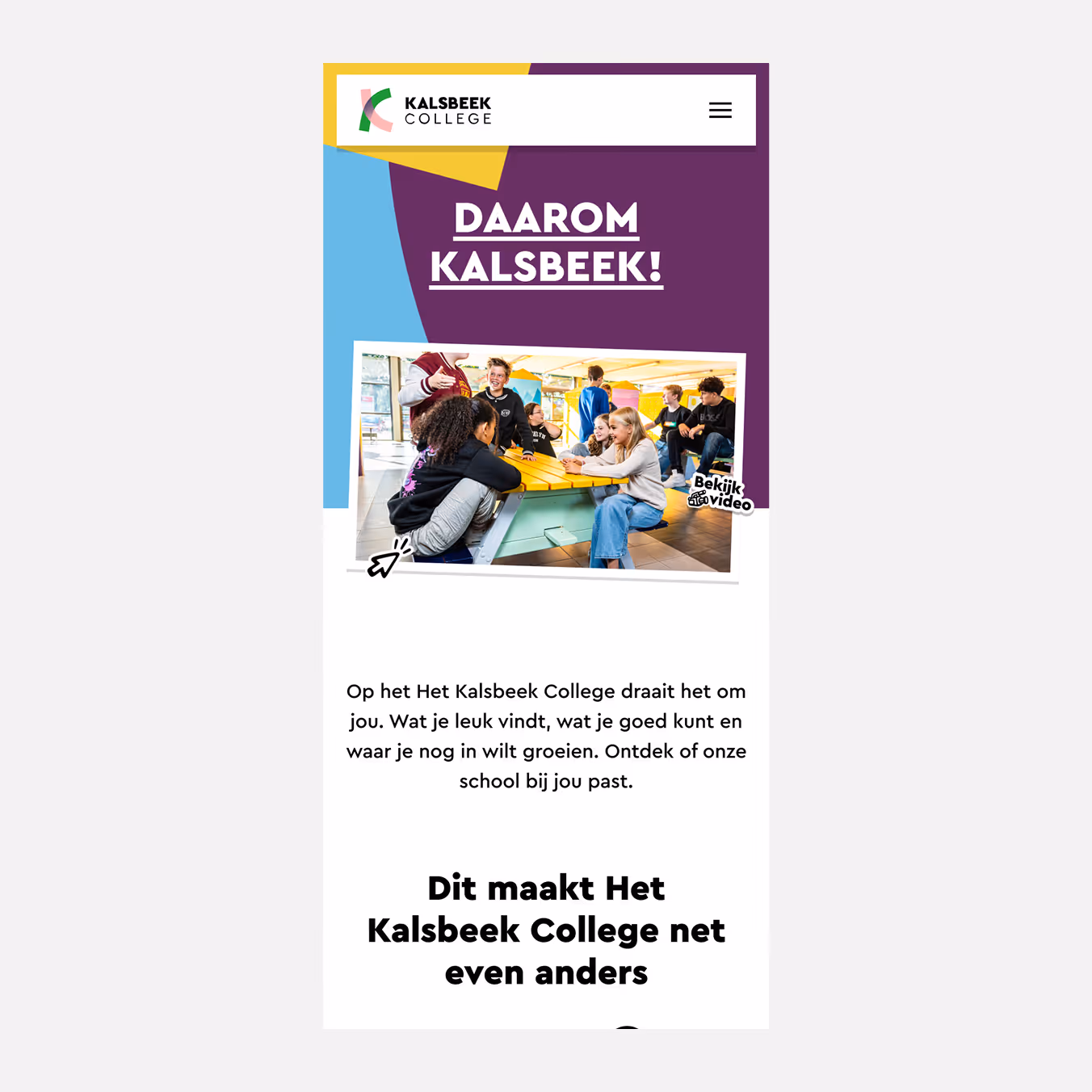
The task wasn't just visual. The existing site was fragmented and insufficiently tailored to the various visitors. We revised the entire information architecture, simplified it considerably and designed a special page aimed at students in grade 8, with a tone and design that matches their experiences and answers the questions that really arise when choosing a school.
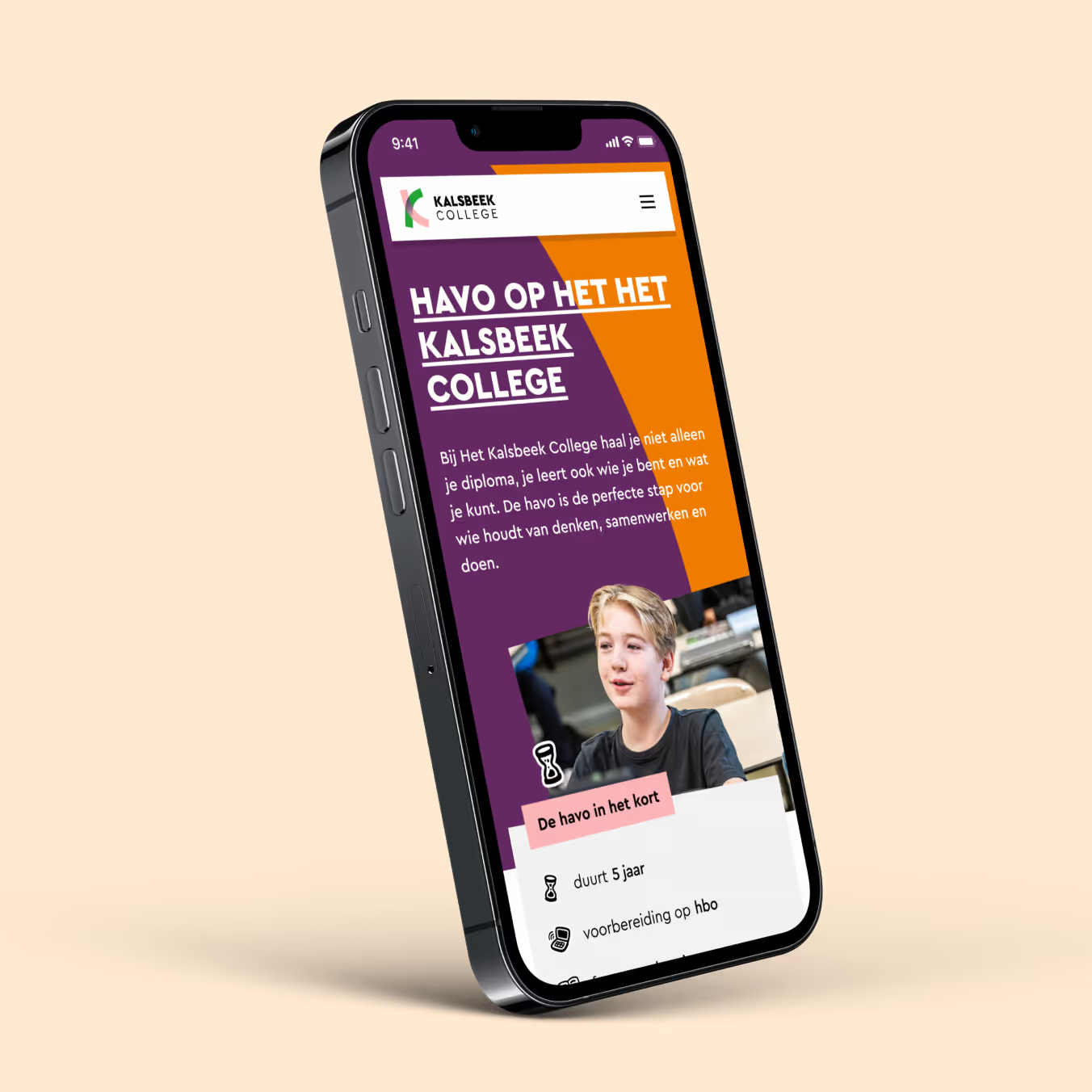
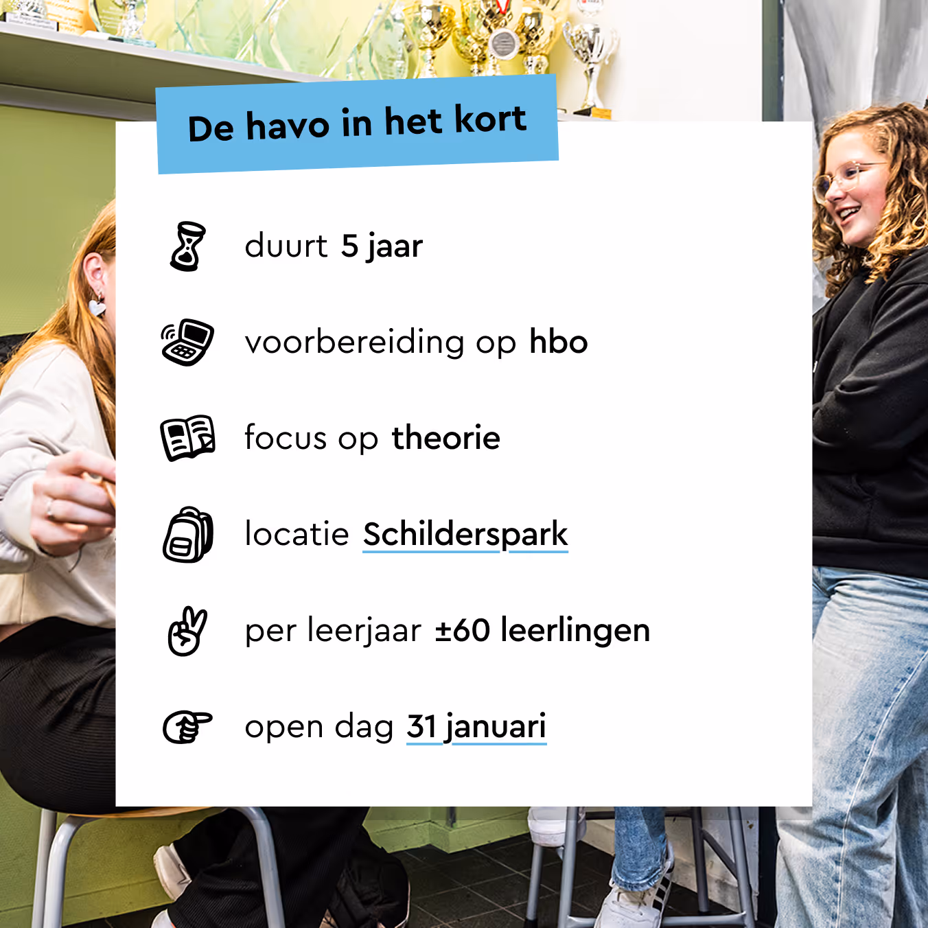
Kalsbeek's existing brand elements were the starting point for building on the visual identity. We expanded the visual language with a set of hand-crafted icons with a playful look. They bring dynamism to an otherwise sleek and organized design, and give the site a personal character that suits a high school.

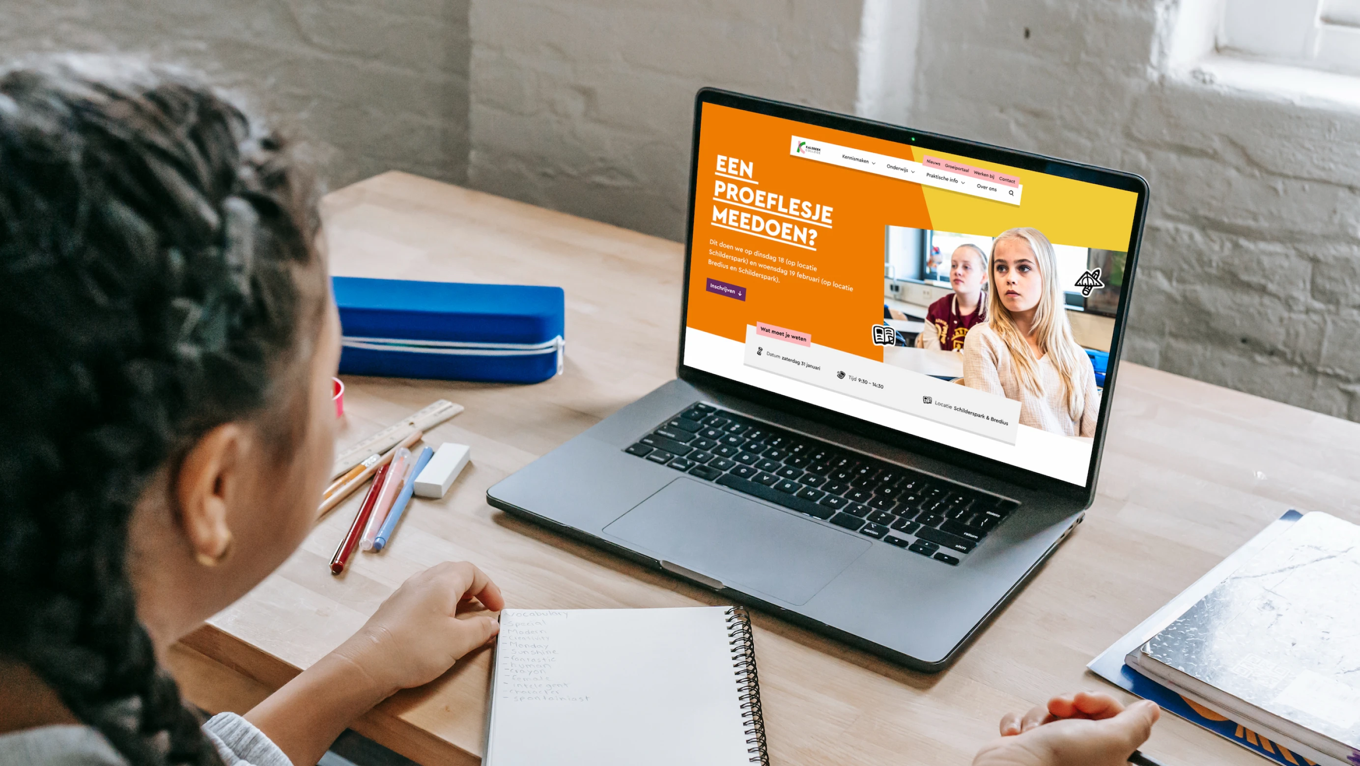
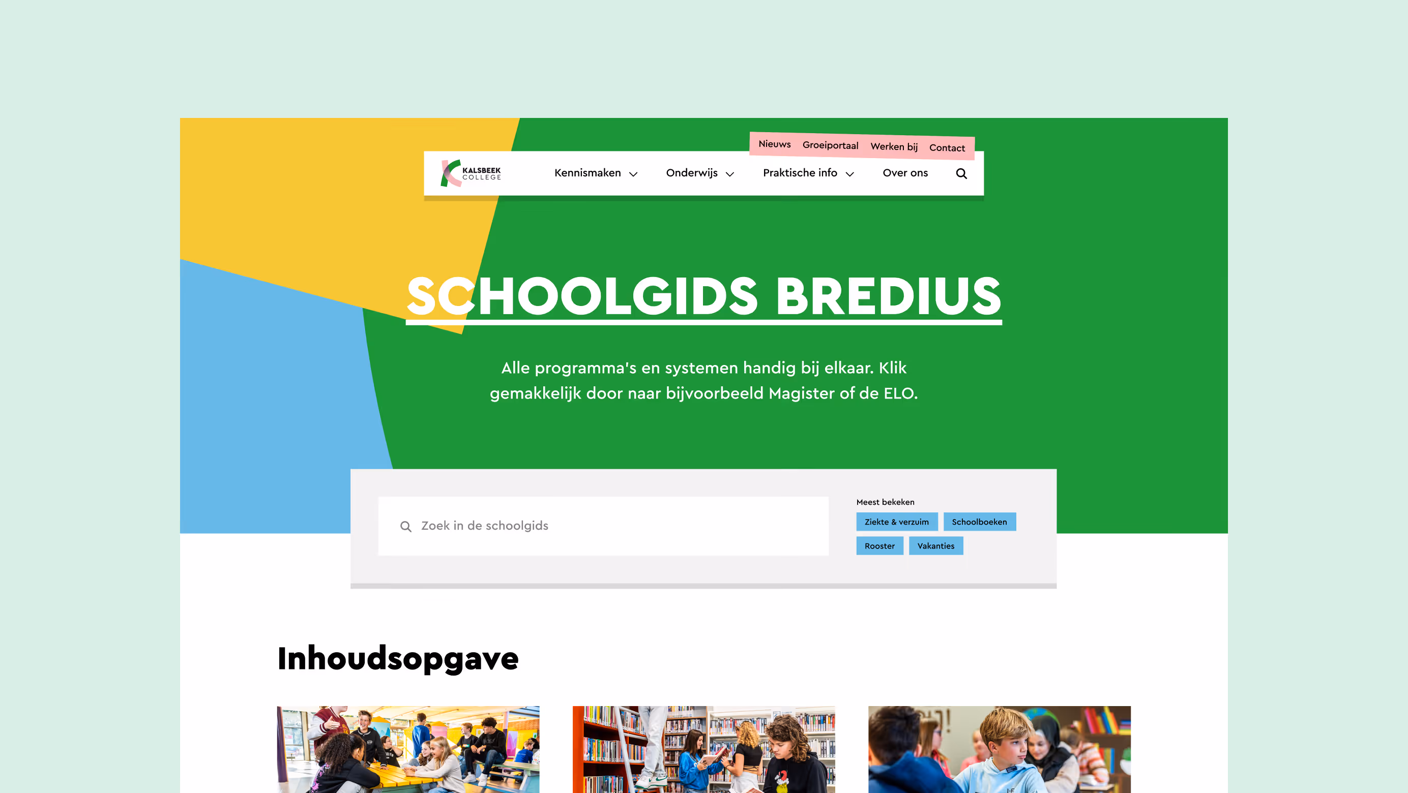
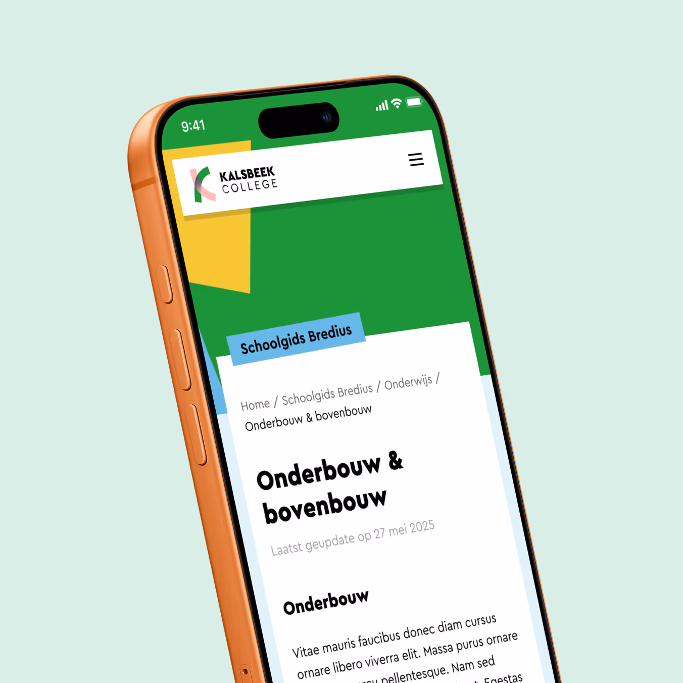
The school guide is one of the most visited parts of the site, but was not yet optimal in terms of user experience. There was no good home page for orienting visitors, and once inside, it was difficult to keep an overview. We revised the structure and added a fixed navigation that is visible on each page. This way, students and parents quickly find what they are looking for without losing their way.
Special thanks to Charlotte de Heij for the opportunity to join us as a student for another few days.;) And to Tabs & Spaces for the technical realization of the website.